When it comes to Point-of-Sale Materials (POSM), we often focus on the big three: visuals, colour, and placement. But there’s another silent persuader at play — typography. More commonly referred to as your font, it’s one of the most powerful tools in shaping shopper behaviour.
The fonts you choose for your displays do more than look good. They affect readability, shape brand perception, and influence how shoppers feel and act. In a high-stakes retail environment, the right typography can be the difference between a passing glance and a scanned QR code.
Why Typography Matters in POSM
Every POSM has a job to do: capture attention, deliver a message quickly, and inspire action. But even the boldest promotion can fail if the font is hard to read or sends the wrong message.
Typography influences shopper behaviour by:
- Enhancing or hindering readability
- Setting the tone and mood
- Reinforcing (or confusing) your brand identity
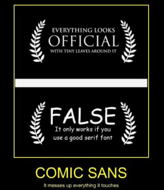
Consider Comic Sans. While it may be appropriate in a classroom or daycare centre, using it to promote a premium smartphone or luxury chocolate bar would instantly undermine the product’s perceived value. Fonts carry personality, and that personality matters.
Readability First, Always
Shoppers don’t stroll, they scan. You have just seconds to grab their attention.
That’s why clear, legible typography is essential, especially for promotions like:
- “Buy One Get One Free”
- “Limited Time Offer”
- “New Arrival”
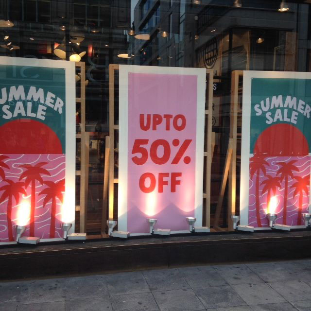
Sans-serif fonts such as Helvetica, Futura, or Montserrat are popular for a reason: they’re clean, modern, and easy to read from a distance.
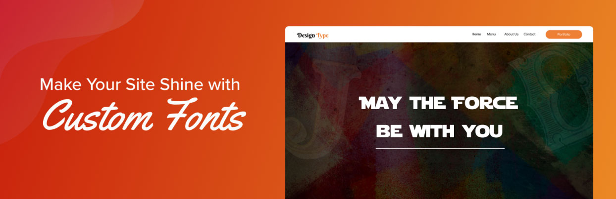
Tip: Keep decorative or script fonts for headlines or accents only. Avoid using them for body copy or product information.
Fonts Speak Louder Than Words
Your typography doesn’t just carry words, it carries emotion.
This is where font psychology comes in.
- Bold, geometric fonts = strength, reliability
- Script fonts = elegance, intimacy
- Rounded fonts = friendliness, fun
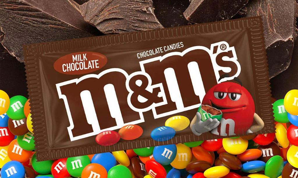
Luxury brands like Chanel use sleek, minimalist serif fonts to suggest exclusivity and refinement. In contrast, playful brands like M&M’s and Lego use rounded, colourful fonts that speak to joy and youthfulness.
Ask yourself: Does this font make sense for my shopper? My product? My story?
Consistency Builds Trust
Typography is a cornerstone of brand identity. Once you’ve chosen fonts that work, stick to them.
Shoppers associate fonts just as strongly as they do colours or logos. Changing fonts too frequently, or across different POSM formats, can confuse customers and weaken brand recognition.
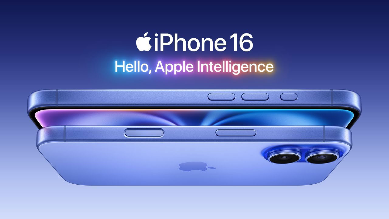
That’s why Apple, for example, has used clean, minimalist type across all its retail signage for years. It reinforces the brand’s modern, premium positioning.
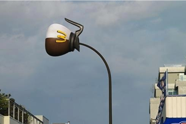
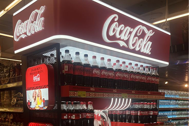
The same rule applies across categories: Maggi, Gardenia, Petronas, Celcom, McDonald’s — their fonts are part of their brand DNA. Consistency equals credibility.
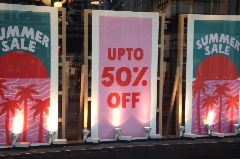
Make Contrast Work for You
A well-chosen font still needs help to stand out. That’s where contrast and background play a crucial role.
Poor contrast like light text on a pastel background, might look stylish in theory but gets lost in brightly lit malls or outdoor kiosks.
- Use dark fonts on light backgrounds or light fonts on dark backgrounds
- Avoid overly thin fonts in high-glare environments
- Add outlines or shadows when needed for clarity
Always test your POSM in real lighting conditions before rollout. What looks crisp on your screen might completely disappear in-store under harsh fluorescent lighting.
Don’t Let the Font Be an Afterthought
Typography is often the unsung hero of a successful POSM campaign. While photography and layout get most of the attention, it’s the font that makes sure your message is actually seen, read, and remembered.
In a world of visual overload, clarity wins. Choose type that speaks your shopper’s language literally and emotionally, and your POSM will go from background noise to in-store impact.