In today’s competitive retail environment, catching a shopper’s eye is no easy feat, especially in multi-brand stores, where your product is just one among dozens vying for attention. Whether it’s a supermarket, pharmacy, or electronics outlet, the challenge is the same: how can your POSM (Point-of-Sale Materials) stand out amidst a sea of competing messages?
The answer lies in strategy, clarity, and an understanding of shopper behaviour. Let’s explore how brands can design POSM that not only commands attention in shared spaces but also drives action.
Understand the Competitive Landscape
Before designing anything, take time to study the store environment. In a multi-brand context, your POSM is not only competing with direct category rivals but also with a wall of visual noise — colours, fonts, promotions, and formats.
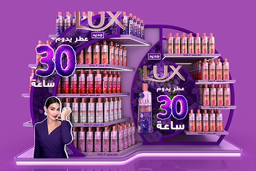
One effective tactic is to choose a distinctive colour palette that contrasts with the category norm. For example, in a pharmacy aisle dominated by white and blue tones, Garnier stands out by using bright tropical green standees that create instant visibility. It’s a simple way to win attention before any shopper even reads the message.
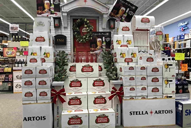
Use Block Display Strategy to Own Space Visually
When physical shelf space is limited, the best alternative is to create visual dominance. Block displays help your brand form a cohesive presence using matching POSM elements such as shelf strips, wobblers, headers, and dump bins, with unified colour and messaging.
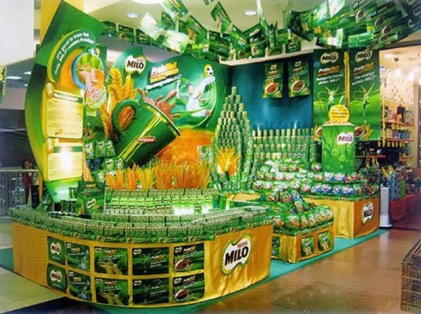
Take Nestlé’s Milo as an example. In supermarkets, the brand consistently uses a full green POSM suite to build a strong, recognisable block that visually anchors the category. The consistency creates the impression of a larger presence, even when space is shared.
Prioritise Clarity and Speed of Communication
In a high-traffic store, you have less than a few seconds to get your message across. This means that your POSM must be instantly readable and emotionally engaging to your potential customers. A tried and trusted method for accomplishing this is by using large, high-contrast fonts and a simple, bold headline. Remember to include only essential information and use images that trigger an emotional connection.
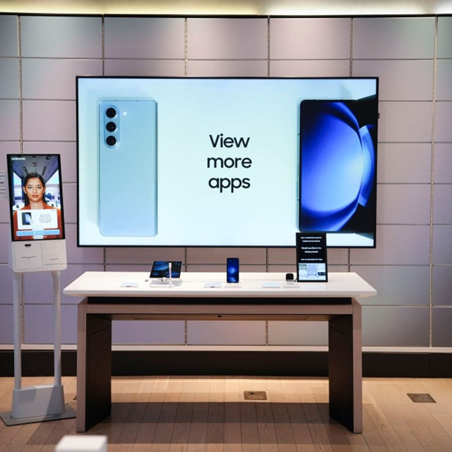
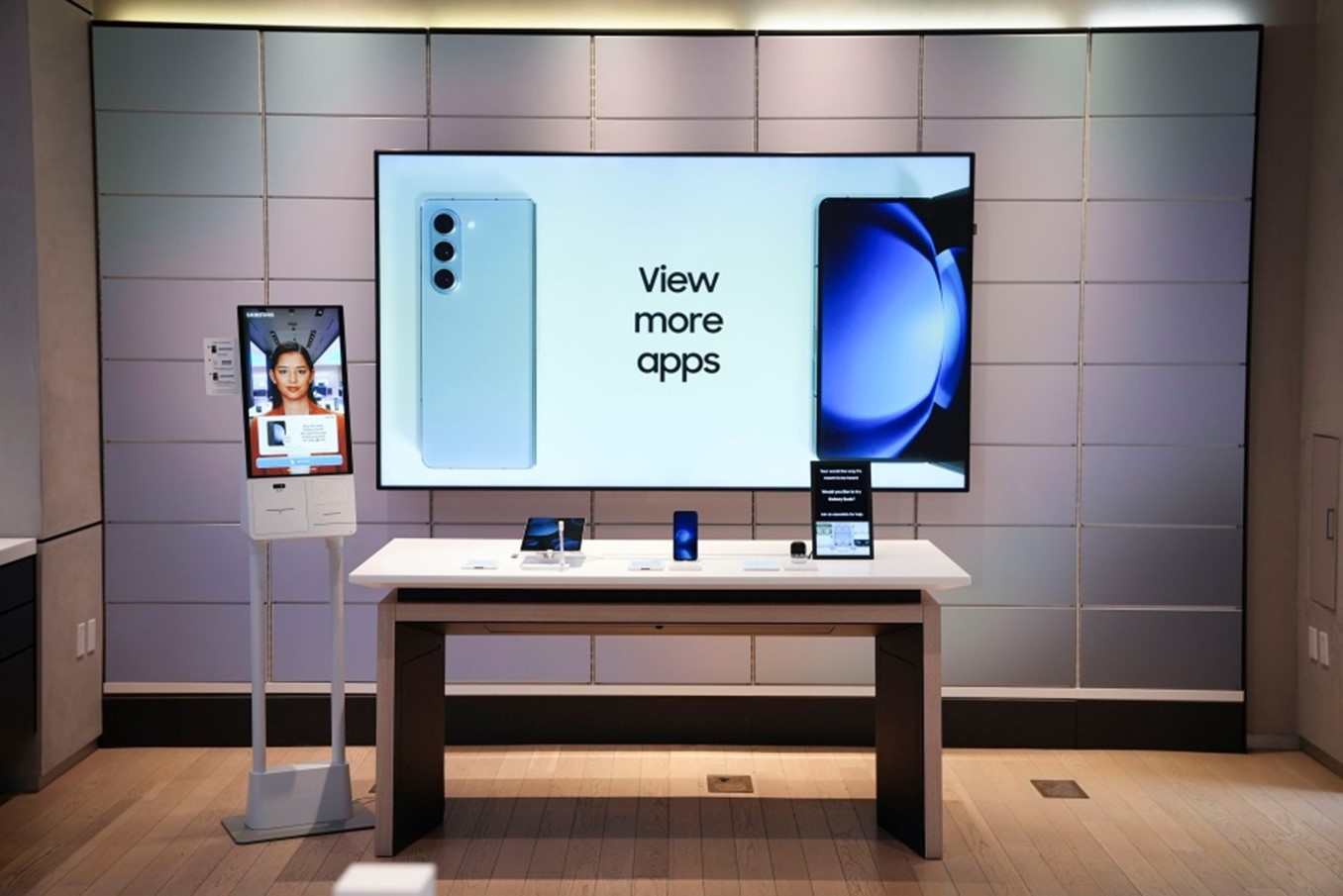
A great example of this being put into practice is by observing Samsung. Often situated in electronics retailers which are extremely visually arresting environments, Samsung often uses POSM with just 3 key visuals: the product, the benefit like “Crystal Clear Display”, and a price or offer for simple, punchy, effective message that immediately communicates the most important points to onlookers.
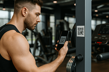
Incorporate Interactivity to Increase Dwell Time
Shoppers are more likely to engage with POSM that invites interaction. Whether it’s a QR code, sample station, light display, or digital screen, interactive POSM can increase both attention and conversion.
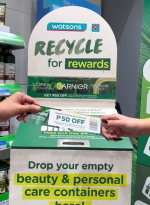
L’Oréal frequently leverages this approach. In selected pharmacies, their POSM includes touch-to-try tester stations or mini digital screens that educate shoppers on product features. This not only drives trial but also reinforces brand credibility and product understanding.
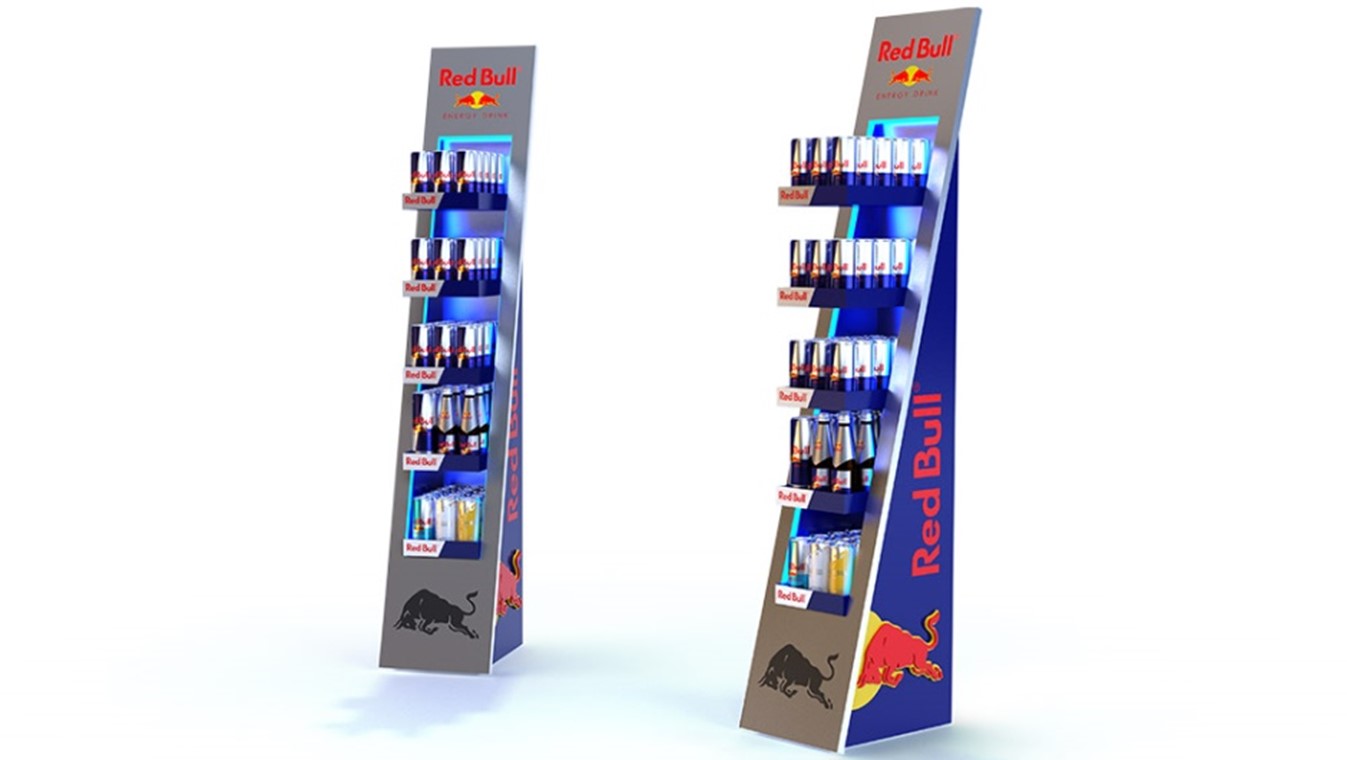
Tailor POSM to Store Layout and Traffic Flow
Not all store layouts are created equal. To maximise impact, understand how shoppers move through the store and place your POSM where attention is highest, such as aisle entrances, gondola ends, and checkout counters.
Design choices should also suit the physical constraints of the space:
- Use tall, narrow displays in tight aisles
- Go wide and horizontal for gondola headers or endcaps
- Consider floor decals or cooler wraps in convenience stores
Red Bull understands this well. In many outlets, they use slim vertical cooler stickers and floor POSM near cashier zones — areas where impulse decisions are most likely to occur.
How to Win in Shared Spaces
Designing POSM for multi-brand stores is both an art and a science. The most successful brands understand the visual competition, communicate clearly, and integrate seamlessly with store layout.
To summarise, effective POSM in shared environments should:
- Visually differentiate through colour and contrast
- Use block display strategies to create brand consistency
- Communicate benefits clearly and quickly
- Integrate interactivity where possible
- Adapt to store format and shopper flow
In a crowded aisle, attention is currency. Brands that design with intention, speed, and clarity are the ones that not only get noticed, but get chosen.