Apple has been in the amazing personal computers products with stellar packaging design for decades. Over the years it developed a reliable formula for packaging that not only represents its unique DNA but also captivates customers time and time again.
But what makes Apple so special? Many brands have tried to emulate their minimalist appeal, but few have been able to do packaging the way Apple does it.
The truth is that it isn’t so simple to do what the Cupertino tech giant does. Apple’s packaging is captivating because it is painstakingly, obsessively designed to be so. Nothing is left to chance.
Apple believes in engaging and emotional first impressions
The genius of the brand’s packaging design is best observed in the Apple unboxing experience. It doesn’t matter if the product in question is a base-model iPod or a flagship spec Macbook Pro, every part of the unboxing experience is measured to be emotionally fulfilling.
Source: Wccftech
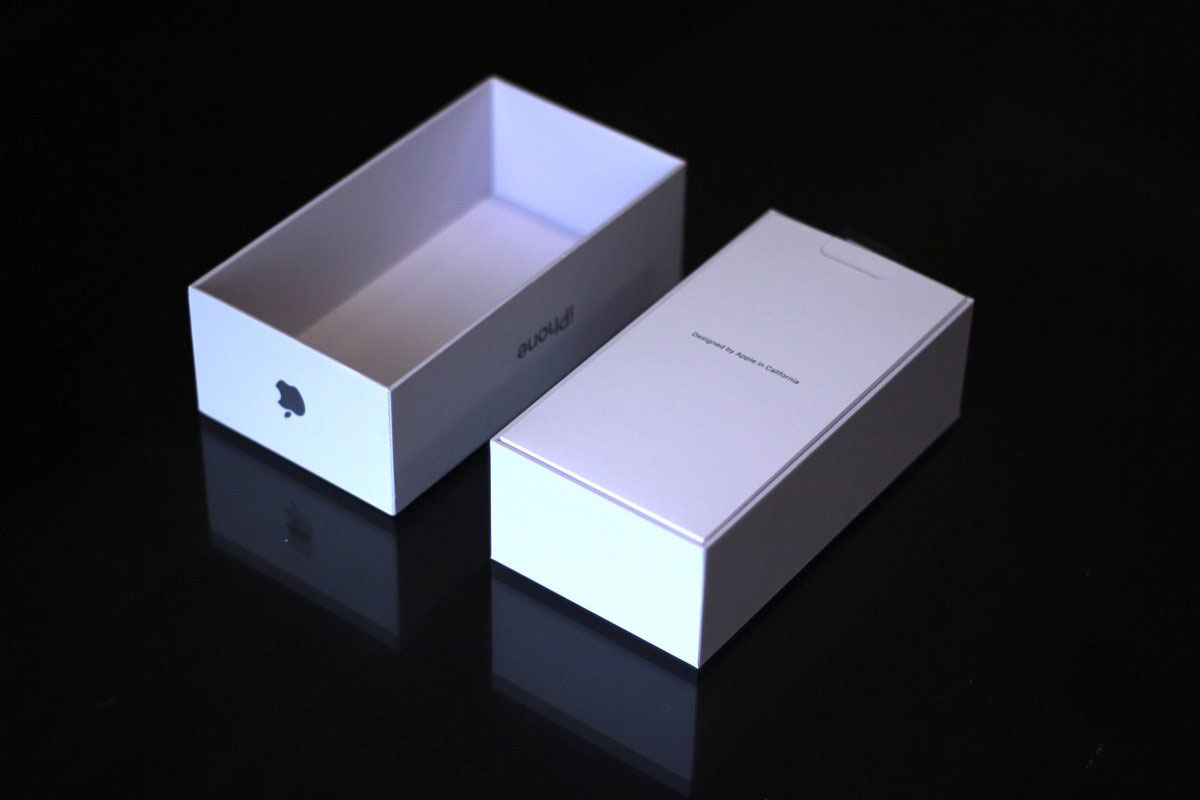
An Apple unboxing experience is synonymous with tactile and aesthetic satisfaction, from peeling off the outer plastic layer to unwinding the charging cable. Fans also create buzz around this experience and enjoy it vicariously, thanks to the unwavering popularity of Apple unboxing videos on YouTube.
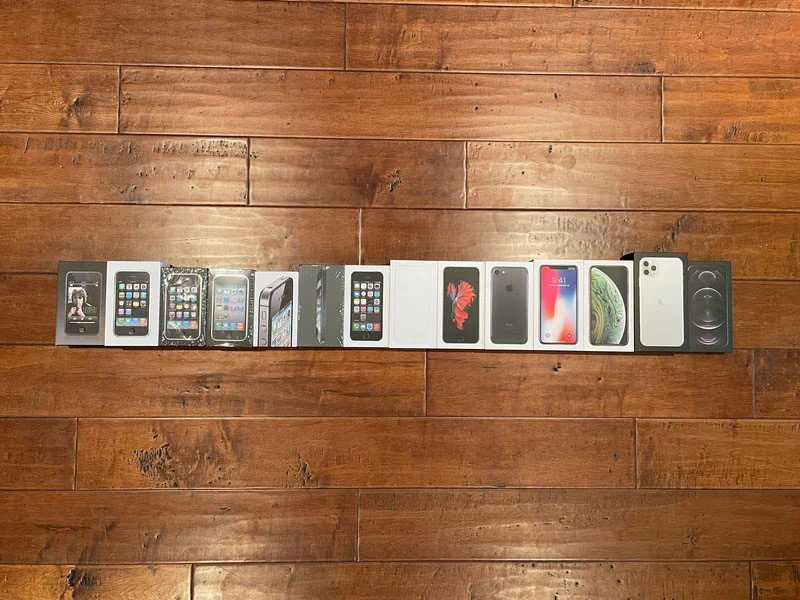
What’s even more interesting is the enduring appeal of boxes that have already been opened. Apple customers have a tendency to not only collect the boxes of the iPhones, iPads, iPods, and Macbooks they’ve purchased through the years, but to also treat them like valued possessions.
Don’t other brands make high-quality, multipurpose product packaging too? Well not many can feel like items one would be proud to display at his or her office desk or at home. If the exact same boxes had a Samsung or Huawei logo, would they be given the same treatment?
Source: VICE
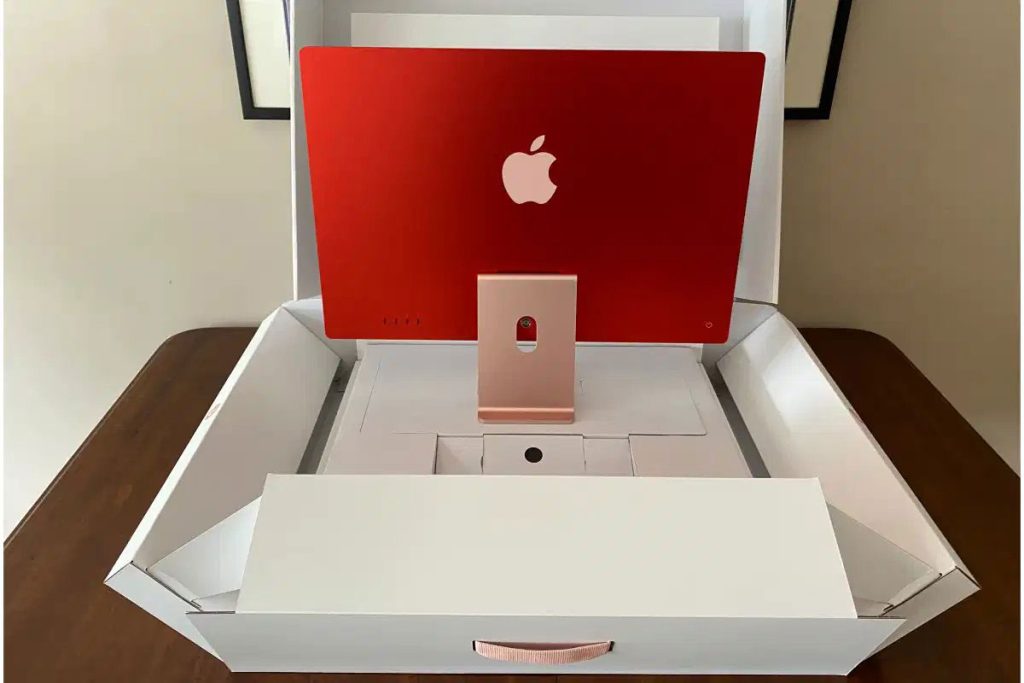
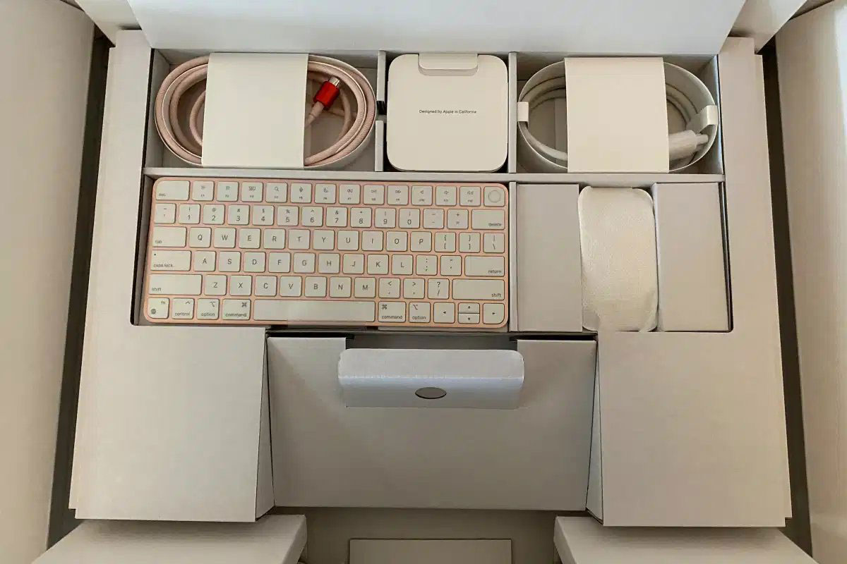
Although Apple employs a consistent minimalist design language to its packaging, it sometimes catches people by surprise. Case in point: the latest iMac series redesigned with a selection of eye-catching colors after nearly a decade.
Source: Macworld

Source: Macworld
Apart from the clever way the iMac’s box has been designed to unfold as excited hands figure out how to unbox it, the accompanying accessories show up in a harmony of matching colors. It’s a beautiful concept, executed simply and effectively.
Marching to the beat of its own drum
Looking and feeling pretty isn’t what makes Apple a leader in smartphones, tablets, and computers. It paves its own way and doesn’t conform to the rest of the market.
But neither is it contrarian for the sake of it. Apple does what works, even if it means being the same as its competitors on certain fronts. In fact, when it comes to the iPhone, competing Android-powered devices would employ cutting-edge technology years before Apple does – from facial recognition to augmented reality (AR) to wireless charging.
Apple isn’t actually playing catch-up; the brand is doing its own thing in its own time and is not in a race with the competition with regard to technology and design.
When it decides to do something seemingly drastic, like the recent decision to ship new iPhone models without a charger in the box, there is a reason (apart from being environmental) that’s linked to its design plans.
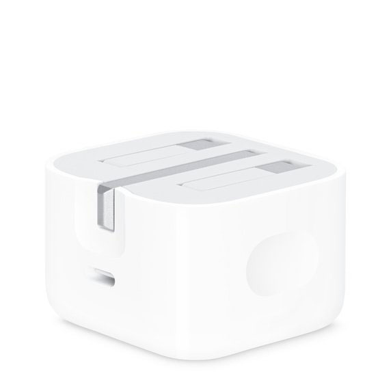
Source: Apple
In this case, Apple has plans for its MagSafe ecosystem of magnetic products, which includes the MagSafe wireless charger. Is it innovative? Not exactly, phones have had wireless charging for the longest time. But it does make sense in the context of Apple’s design DNA, which is to make intuitive products within a cohesive ecosystem of products that, at the end of the day, makes them a whole lot of money.
Hence something as simple as a cost-saving omission in the packaging of a product is in fact, a strategic move on Apple’s part. When it decided to get rid of the headphone jack on the iPhone 7, it was making way for wireless headphones (Beats in particular), and the market soon followed suit. Similarly, the loss of plug-in chargers is signaling something new from the brand.
It’s all connected – when you unbox an Apple product, you are being welcomed into the world of its products.
Source: Apple
Knowing what it takes to be the best
If there is one thing the team at Apple understands, it’s that you have the opportunity to make a good first impression over and over again. Every time a customer returns to buy a new product, unboxing it is like meeting for the first time once more.
Obviously, Apple’s products have to be great as well, and they don’t often disappoint on that front. Even if it occasionally falls short by any objective standard, there’s no reason for the company to worry about being outdone by the competition, because it has built an ecosystem and a following over the years that endure short-term setbacks.
Ultimately, packaging has been a key component of that ecosystem, giving the company a competitive edge across its entire product portfolio.
What would you want your product packaging to deliver?