
At some point in a marketer’s career, there are self-doubts when asked to comment on a piece of artwork presented by the agency. There you are, facing people who do artwork design as a profession, and you need to comment without appearing, dare I say, foolish. The artwork does not seem right to you, but self-doubt is rearing its head. What are they thinking behind their eager smiles?
‘Client has no taste.’
‘Client sets out to make my life miserable.’
‘Client doesn’t know what he wants!’
So, how should a marketer evaluate artwork, and in the process, give constructive, actionable feedback to the agency?
First things first, there is a difference between designing a piece for one’s own interest and designing a commercial piece. The former almost entirely focuses on the aesthetics of the piece. The latter requires the agency to exercise empathy and understand the commercial needs of the client.
Consistency in Evaluation Helps Agency Fulfil Brief Effectively
What’s the best way to ensure agencies effectively fulfill the design brief? The answer – by letting them know how you evaluate, consistently.
But, you may say different artwork may need to emphasize different things. Hear us out, and you will find the guide below covers most, if not all.
We call this the AOBA approach. It stands for Attention, Objective, Branding, Aesthetics, and in that order.
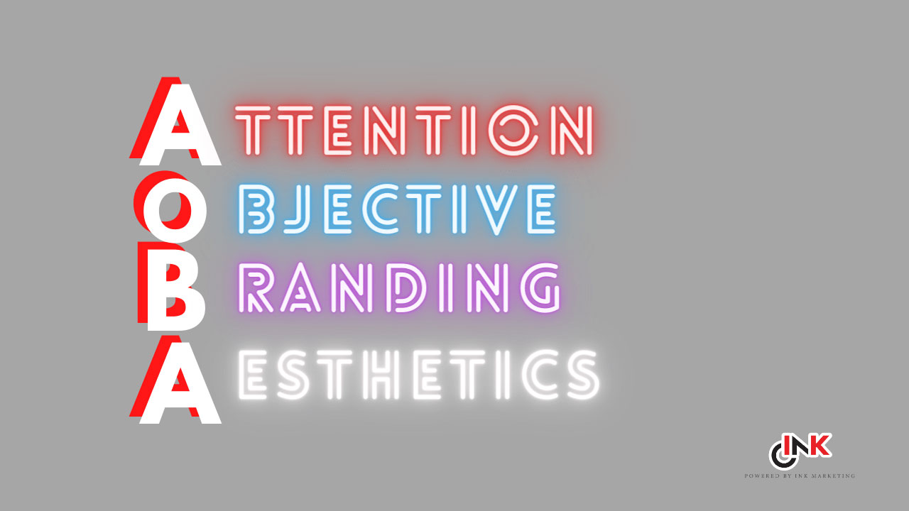
Order Matters
Some may argue that the objective should always come before anything else. Consider this – some marketers often comment that a piece of design is boring. On the other hand, the designer complains that after fulfilling the requirements in the client’s checklist, there is no room for creativity.
This is why we place Attention before Objective. A design, even if it fulfills all the objectives, means nothing if no one sees it. The first requirement is always, always to catch the attention of the target audience. An unseen advertisement is a useless advertisement.
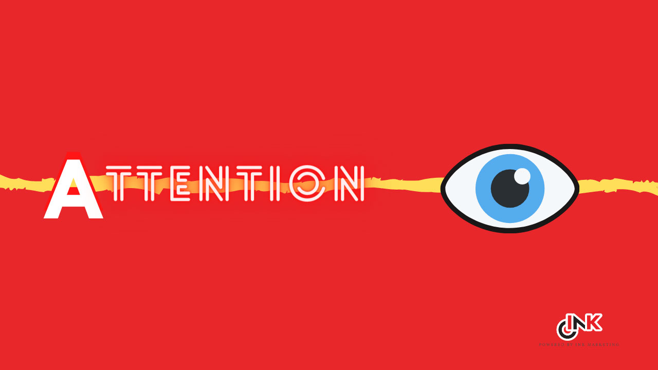
ATTENTION
- Will it catch the attention of the target audience (not yours, not your colleagues)?
- What is the element that makes it stand out? Consider the context it is supposed to reach out to the target audience. Among the other pages of newspapers? Among the plethora of products on the shelves? In a noisy public bus?
- The attention-grabbing element is the design challenge. It could be a nice music tune, originality of the idea, minimalist treatment, beautiful typeface, clear focal point and many others.
- You will realize that a piece that has everything shouting for attention, ends up getting none. The focal point is important.
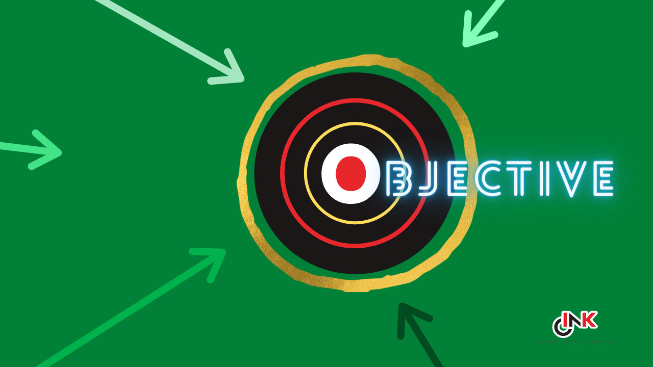
OBJECTIVE
– Will it make an impact to achieve the objective?
– The objective is the desired response from the target audience, either action or perception. It could be to create awareness, to induce trial, to strengthen a belief, to remember better and many others.
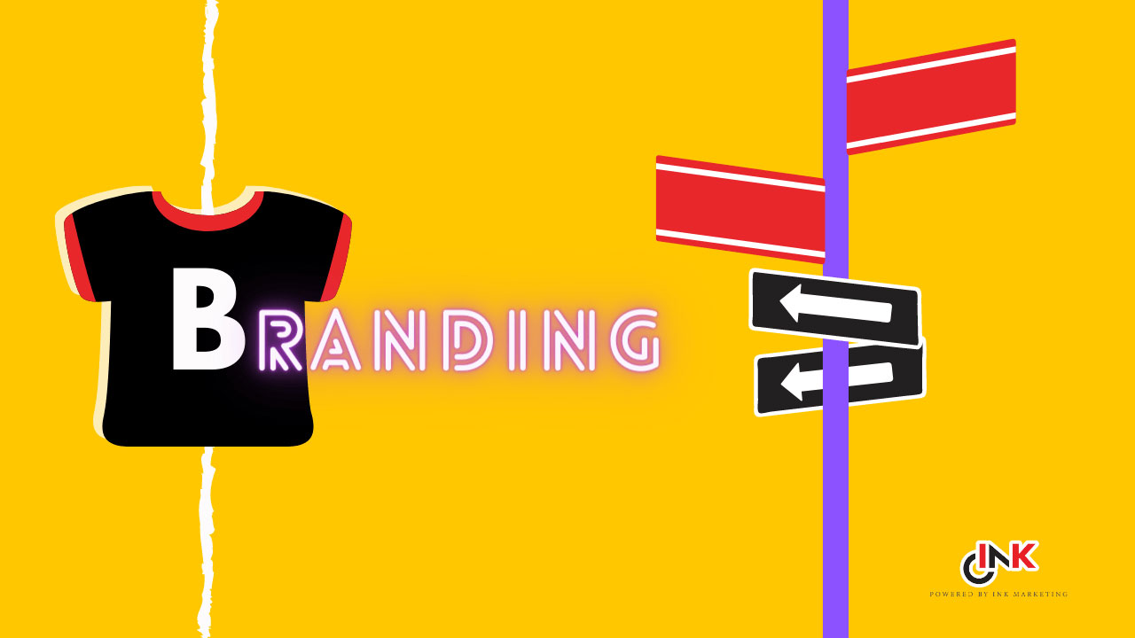
BRANDING
– Many jargons are used in this area, such as CI (corporate identity), brand DNA or brand positioning. Apply your company’s version of brand mandatories. Ensure the artwork fulfill them, be it the inclusion of product shot, brand logo, brand tagline, brand typeface, color, and even the trademark tone and manner/treatment.
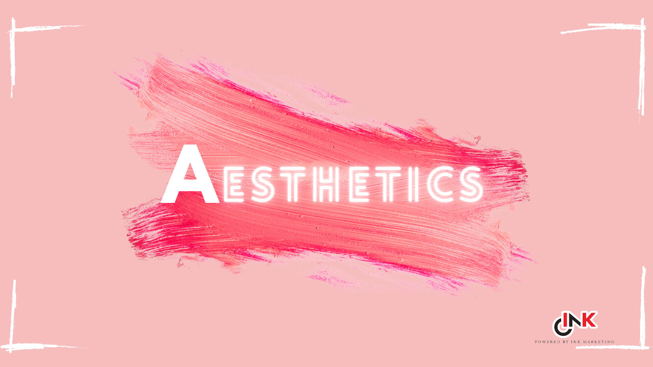
AESTHETICS
– Finally, evaluate each design element of the artwork. Are they refined? Is there a better layout? Why use this typeface and not the other?
Putting All Together
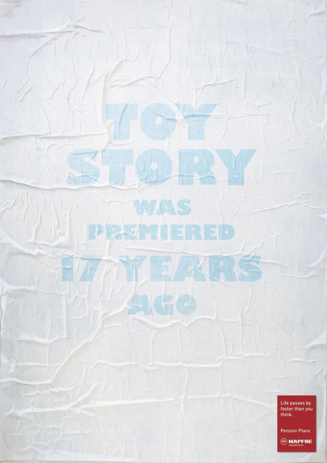
Let’s refer to the sample print advertisement:
Attention – the minimalist treatment should make it stand out from the other pages of the newspaper. The crumpled surface further enhances its attention-grabbing. Imagine it with a plain, flat background, it will look like an ordinary text advertisement.
Objective – The desired response is to get the target audience to start thinking about pension plans early by demonstrating how fast life passes by. Toy story is likely to be a movie the target audience brought their kids to watch when they were young. Now they are at the right age to start thinking about pension plans.
Branding – The brand name, logo, and message though small in size, but contrast sharply with the rest, making them extremely visible.
Aesthetics – Imagine the font color to be more solid. Yes, it will make it more readable. But it does not help to create the faded, long-time-ago imagery.
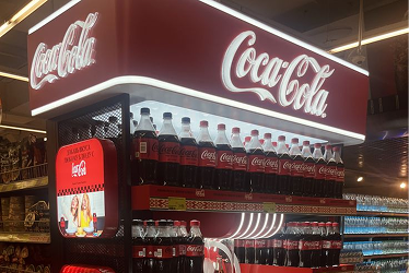
Evaluating the Design of Product Displays
Having explained the steps in evaluating design – aka AOBA, how can marketers use this process in evaluating Product Display design?
Very much the same actually!
Similar to print ads and digital ads, evaluating POSM and product displays can be put through the AOBA evaluating criteria.
Here’s a brief run-through as to how AOBA can be applied to Point of Sales Displays.
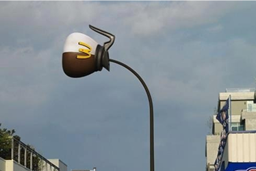
Attention: Product displays and POSM are what we call the in-store salesman. Eye-catching and attractive displays is a must. Hence, marketers have to evaluate whether the display catches the attention of the audience. You can start a “sales pitch” if no one is listening, can you?
Objective: Specify the objective of your product display / POSM. Do you want customers to pick items off the display? Or rather, would you like them to direct their attention to another shelf or rack nearby? Take a standee as an example, if you want people to pick items off it, it has to be easy to reach as well. Their eyes have to be directed to the products on the shelf. The air gap must be adequate that pulling it out of the shelf isn’t too much a hassle.
Branding: Now for the main event, Branding. Whether you’re from a large corporation or a small family-owned business. Having consistent branding throughout your displays is important. Are the colors of your logo in-line with your brand’s standard? Are the fonts correct? Does the entirety of the display represent your brand image?
Aesthetics: Defined by the Cambridge Dictionary, Aesthetics is “the formal study of the principles of art and beauty”. In layman terms, does it look good? Is it pleasant to look at? Is there anything that can be moved around to make the design more proportionate? Aesthetics can be evaluated in the form of the POSM’s structure and even the design printed on it.
Harmony is the Key, Friend.
In every project, all parties involved play a role in achieving the best possible outcome. Joyous collaboration can be achieved through proper communication, this includes critiquing and evaluating design work. Often times, conflict and controversy can arise from the evaluation of design, widely known as a “subjective” topic. Though there may not be an absolute method to evaluate design work, we believe that establishing an “SOP” for evaluation can save everyone much time and unnecessary squabble. Try it out!
If you found this article useful or think someone might benefit from it, do share it with them.