In the age of endless choice and digital distraction, getting someone to walk past your store is hard enough. Getting them to step in and buy? That’s the real challenge.
Many shoppers today are browsers, not buyers. They stroll past storefronts, glance at displays, and keep walking. The key to capturing their attention and converting them lies in clever, creative, and conversion-driven POSM design.
Here’s how your brand can transform window shopping into in-store conversion with POSM that truly engages.
1. Start with a Visual Hook
The first few seconds are critical. You have a narrow window (pun intended) to grab attention. Your POSM must function like a billboard — bold, clear, and compelling.
- Use high-contrast colours and clean layouts that are easy to digest at a glance
- Feature hero products with clear pricing or value proposition
- Leverage movement or lighting to draw the eye
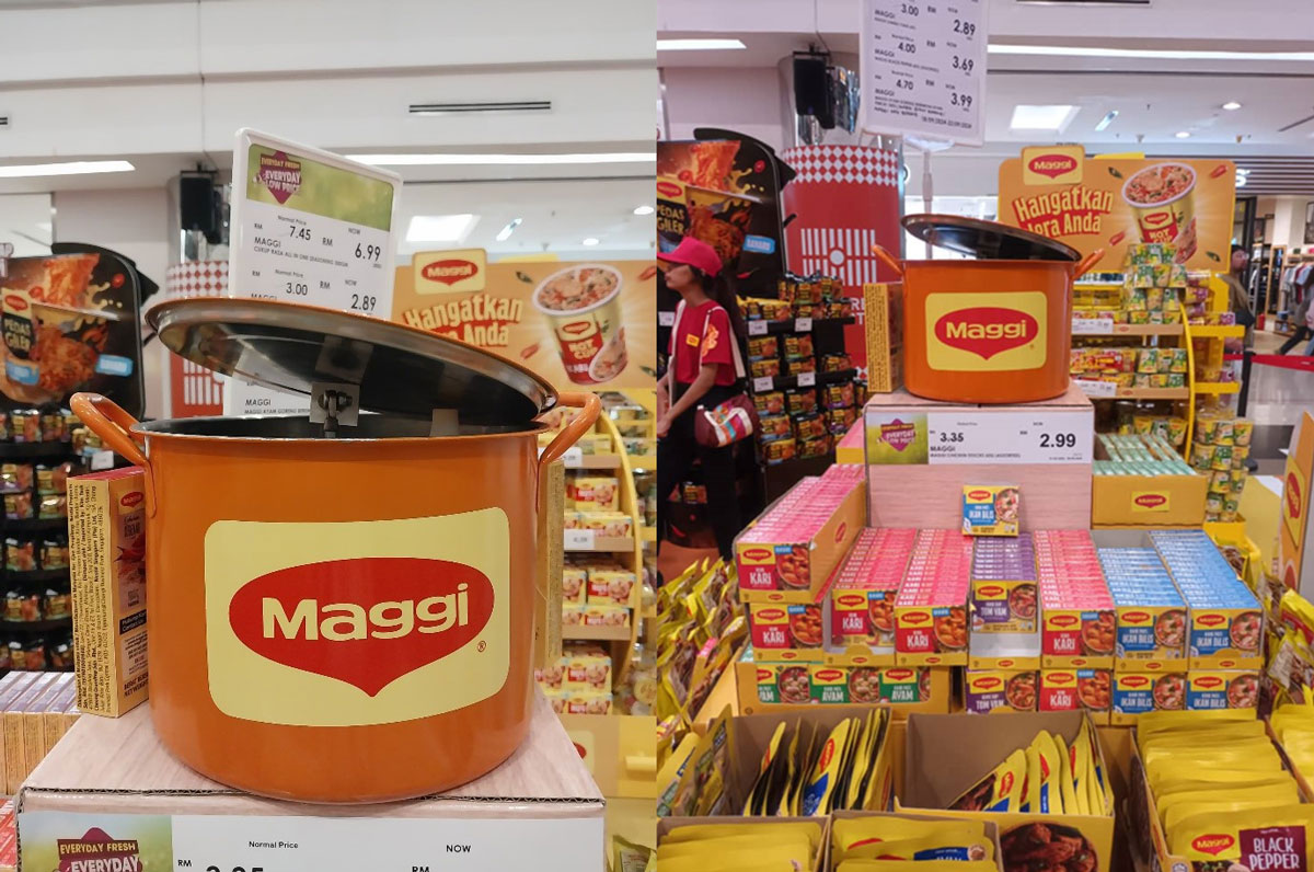
Example: INK’s Maggi Singing Pot display featured a bubbling pot with a lid that lifted and lowered rhythmically, while a cheerful tune played in sync. This motion and sound combination immediately drew attention, creating a sensory experience that stopped shoppers in their tracks – a perfect visual hook.
2. Tell a Story in Seconds
People are drawn to narratives, not noise. Good POSM design turns a simple product display into a micro-story about how your product fits into the shopper’s life.
Instead of just showing products, show how they solve a problem or elevate an experience.
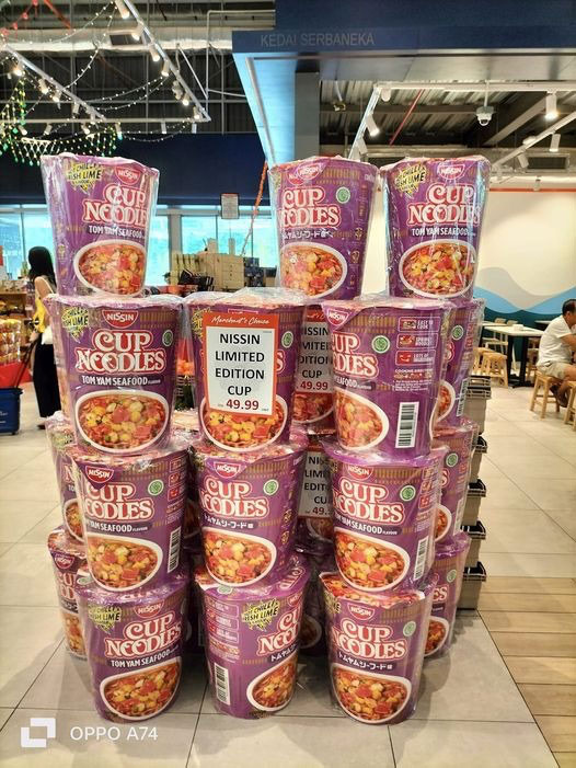
Example: INK’s Nissin Giant Cup Noodles display drew attention through sheer scale. The oversized cup noodle prop stopped passersby in their tracks, signalling something bold, new, and larger than life. Without a single line of copy, it told a story of indulgence, comfort, and curiosity – all delivered in seconds.
Add context, emotion, or utility, and you’ll pull browsers in for a closer look.
3. Create an Interactive Touchpoint
Shoppers are far more likely to convert if they interact with your display.
Consider POSM that includes:
- Try-me buttons or scent testers for beauty and fragrance brands
- Touchscreen displays to explore product ranges
- QR codes for digital vouchers, how-to videos, or AR experiences
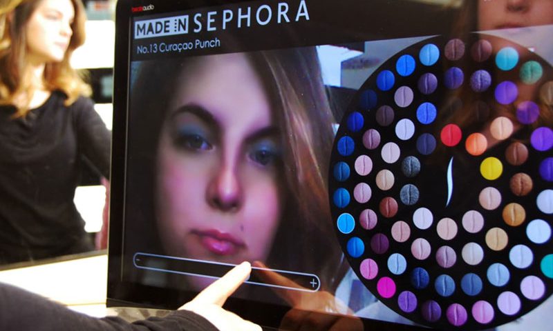
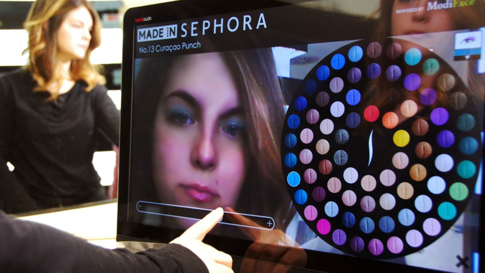
Example: Sephora’s in-store Beauty IQ stations and AR-powered mirrors let customers scan their skin tone and try on products virtually. It’s convenient, personal, and hard to walk away from empty-handed.
4. Highlight Value at the Right Moment
People hesitate when unsure about value. Your POSM should remove doubt and create urgency.
- Use shelf-edge POSM like shelftalkers and wobblers to highlight:
- “Best Seller”
- “Limited Time Offer”
- “Buy 2 Free 1”
- Reinforce social proof with tags like “Loved by 5,000 Malaysians”
- Add a clear CTA, like “Try Now”, “Scan Here” or “Only While Stocks Last”
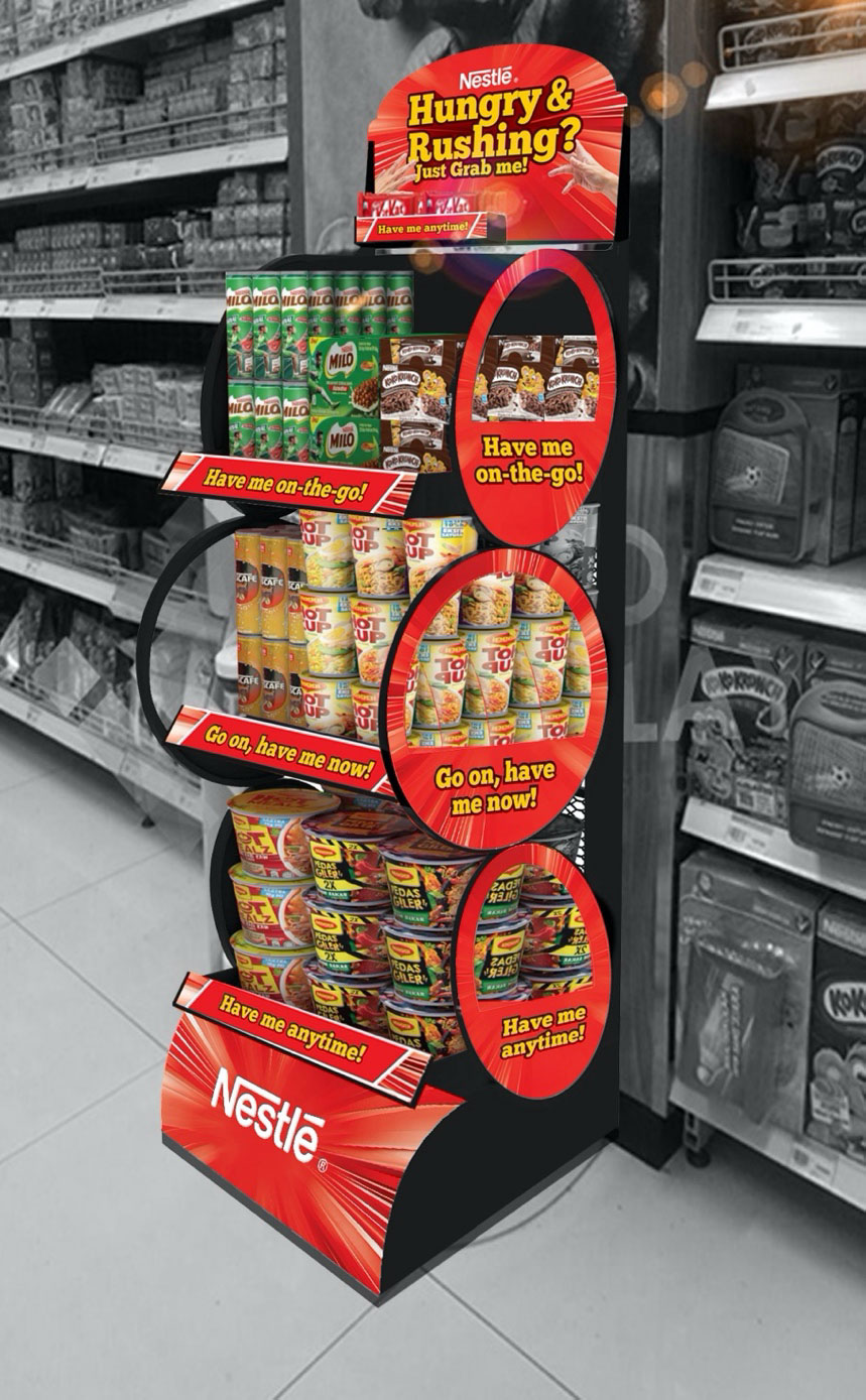
Example: INK’s Nestlé standee was designed to house multiple Nestlé products across categories, with each section clearly marked with a CTA such as “Have me on-the-go”, “Go on, have me now!”, or “Have me anytime”. The design made it easy for shoppers to recognise product benefits and act on impulse.
Don’t make shoppers search for the benefit. Spell it out. Boldly.
5. Align with the Shopper Journey
Where your POSM is placed matters just as much as what it says.
Place POSM near:
- Store entrances (to invite people in)
- High-traffic aisles (to catch attention)
- Checkout areas (to encourage final add-ons)
Your messaging should evolve with each point of engagement:
- Invite at the entrance
- Inform and persuade in-aisle
- Remind or upsell at checkout
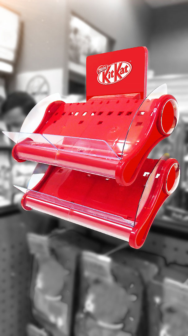
Example: INK’s Nestlé KitKat standee, strategically placed at the checkout zone, encouraged spontaneous add-on purchases. It capitalised on dwell time and impulse behaviour, turning wait time into conversion time.
6. Make POSM Feel Personal
Personalisation does not always mean having someone’s name printed on a cup. Sometimes, it means mirroring shopper preferences or lifestyle.
Design POSM to match:
- Local language or cultural nuances
- Popular use cases or seasonal relevance
- Shopper profiles (e.g. “Perfect for Busy Parents”, “For Weekend Road Trips”)
Example: INK’s Nestlé block display system featured modular panels in Bahasa Malaysia, ensuring cultural relevance and readability. By addressing shoppers in their preferred language, the POSM created familiarity and inclusiveness, especially in neighbourhood marts.
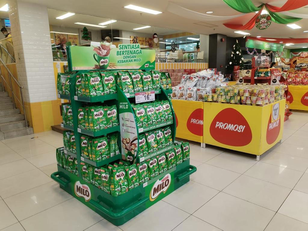
People are more likely to buy when they feel seen. Tailor your messaging for your core audience, not the masses.
7. Re-engage the Exit Path
Don’t forget, the end of the journey can also be the beginning of the next one.
Use POSM at exits to offer:
- A scan-to-win contest
- A loyalty sign-up QR code
- A reminder to follow on social media for exclusive offers
It helps turn a one-time browser into a future buyer, even if they don’t convert on the first visit.
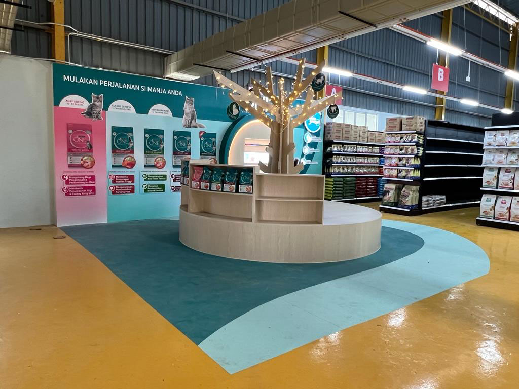
Example: INK’s Purina ONE corner dress-up featured seating space and educational posters just outside the store area. It invited pet owners to pause, and learn more about nutrition – extending the POSM experience beyond the transaction.
From Passive to Purchase
The difference between a shopper who walks by and a shopper who walks in often comes down to how you engage them at the point of sale.
By designing POSM that is bold, useful, emotionally resonant, and well-placed, your brand can transform moments of interest into moments of action.
Because in today’s fast-paced retail environment, POSM isn’t just about looking good. It’s about doing the job — converting browsers into buyers.

