What makes an exciting and effective website? The best ones don’t necessarily have to be the most visually stunning ones. They have to be beautiful but effective in engaging and ultimately converting visitors.
On this ultimate end, first impressions matter: If a site’s landing page hits it off with a visitor, they’re likely to continue exploring the website.
How do we know what types of landing pages work best? Here are 4 great examples to help anyone start (and why):
Netflix Malaysia
Main takeaway: Lean, clean, and clear. Minimal by function, not by aesthetic.
Notice what’s interesting about one of the world’s most popular streaming platforms: there isn’t a website menu bar at the top of the landing page. Everything that a site visitor needs from Netflix is already there.
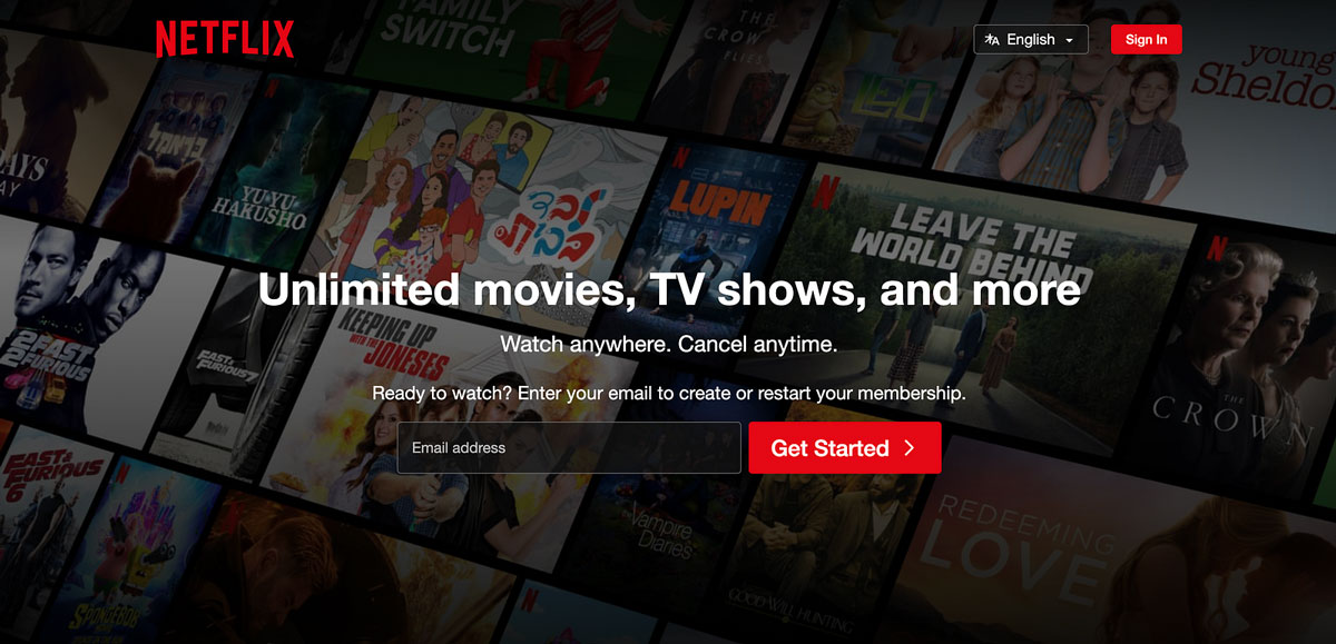
Due to its popularity, Netflix doesn’t need to sell its site visitors on why they should sign up. With concise copy that captures the main benefits of the service, they are prompted to sign up for an account from the offing.
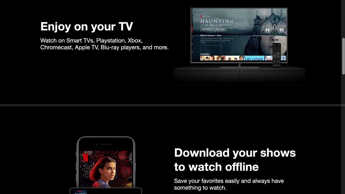
For those who are not yet sold and need some convincing, they only need to scroll a little further to arrive at the other features and benefits of the service, before arriving at the dropdown FAQ section at the end of the page.
The minimalism of Netflix is not for ostentation, not to say “Hey look how sleek and clean I am”. Instead, it’s minimal by function, to ensure that its benefits are delivered quickly and clearly.
Airbnb
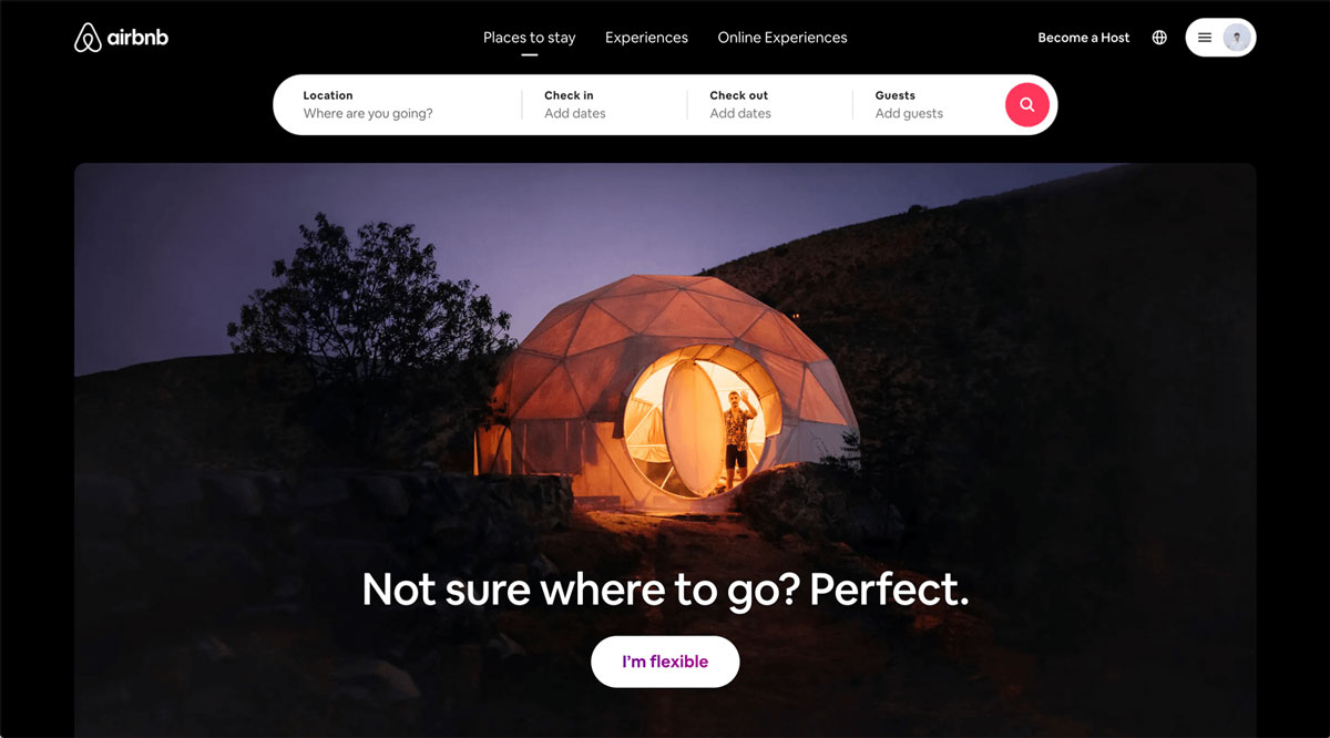
Main takeaway: Punchy, clear, and richly local while being globally relevant.
Similar to Netflix, Airbnb keeps its landing page clean and simple minus the flash. Much like other travel websites (Agoda, Traveloka, Trivago etc.), visitors can key in their preferred destinations and the details of their travel.
However, there is also an added invitation to adventure using catchy copy, followed by a call-to-action (CTA) that lets visitors roll the dice for some potentially surprising suggestions.
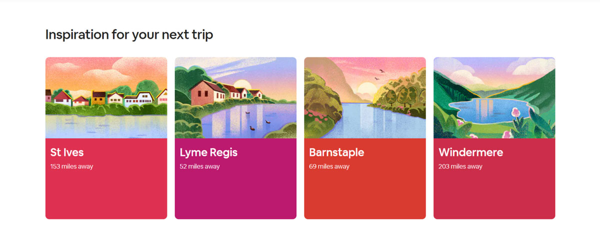
Based on each visitor’s current location, Airbnb would line up cards for inspiration on where they might want to travel locally. These cards pack plenty of visual punch, featuring gorgeous illustrations of each recommended location.
Further down the page, visitors find more vibrant cards that recommend ‘Experiences’ with gorgeous photography in-frame. The mix of illustrations and photography gives an otherwise plain website a touch of variety while keeping it grounded.
While Airbnb focuses on local stays and experiences, it still curates global experiences for its website visitors, rather than demarcating what’s local and what’s abroad. This simple move communicates a sense of borderless travel and strengthens its brand as richly relevant yet truly global.
Tiger Street Food
Main takeaway: Maintains focus amidst a clutter of info. An enticing gateway into a bigger virtual experience.
Tiger’s gambit during a more relaxed lockdown period of the pandemic paid off in the form of an engaging experience that tied together the virtual and physical.
The virtual street food ‘Xperience’ allowed visitors to roam around a virtual night market and order food from hawker stalls. These are actual hawker stalls that would deliver food to the addresses of their virtual customers.
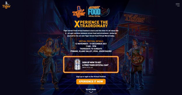
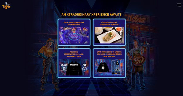
While the virtual experience itself offered lots of fun, the Tiger’s initial sign-up page featured cohesive visuals to that virtual world for a seamless aesthetic. The only issue was its noisy neon aesthetics, which risked muddling the landing page.
Nevertheless, the website managed to achieve focus by employing a narrow column layout and used a vignette effect to frame the backdrop illustration. In doing so, page visitors only had to look from up to down to capture the info they needed.
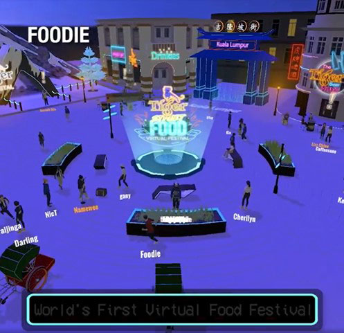
Source: KL Foodie (Facebook)
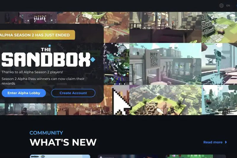
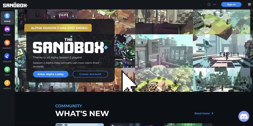
The Sandbox Game
Main takeaway: Made more sense (though not fully) of a new and sometimes puzzling concept of the Metaverse.
The Sandbox Game is by no means an easy website to navigate. But with enough attention one could start to make sense of a concept that eludes many – the Metaverse.
In short, the Metaverse is a digital economy (with its own currencies and trade) that comes in the form of a seamless virtual world, where ‘assets’ i.e. items can be moved from one platform to another.
Players can build and monetize in the Metaverse. For instance, Snoop Dogg created ‘land’ worth $450,000 plus exclusive party experiences in the The Sandbox Game.
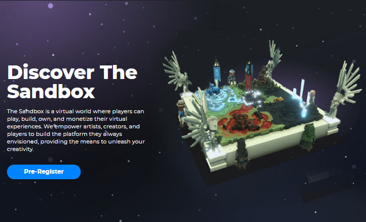
Of course, it’s a lot more complex than that, but The Sandbox Game showcases how cryptocurrencies, blockchain and non-fungible tokens (NFTs) can be tied together through gamification. It’s a world where one could begin to grasp the practicalities of these otherwise confusing new realities.
Land, Engage, Convert
Once a site visitor arrives at its landing page, they would typically leave after 15 seconds – that is, if they’re not engaged enough to stick around.
That’s why it’s key for any website developer to nail their landing page. Very few people would try to check out the other pages if the landing page doesn’t do a sufficient job in capturing and sustaining their attention.
Some may be more complex than others, but the most engaging and powerful websites are typically the ones that manage to reel visitors in using the simplest means, executed perfectly. That may not always be the case, but it’s definitely a good principle to start with when it comes to designing websites.
What are the most engaging websites you’ve visited?