There’s a moment right before payment when shoppers are most vulnerable to one thing: convenience. They’ve already decided to buy something. Their wallet is out. Their brain is switching into “wrap up” mode. If your checkout POSM can make the next decision feel effortless, you win the final five seconds. This is why checkout remains a powerful zone for unplanned add-ons.
Below are practical, high-impact principles for checkout POSM that sells without needing staff, a promoter, or a hard push.
1) Write for the final five seconds
Checkout copy is not for persuasion. It’s for permission. The shopper is asking: “Do I need this now?”
Use short triggers that match the checkout mindset:
- “Forgot this?”
- “Add one for the road”
- “Small treat, big mood”
- “Last chance before you go”
- “Save time later”
Keep it benefit-first, not brand-first. At checkout, the logo is secondary. The job is to reduce hesitation.
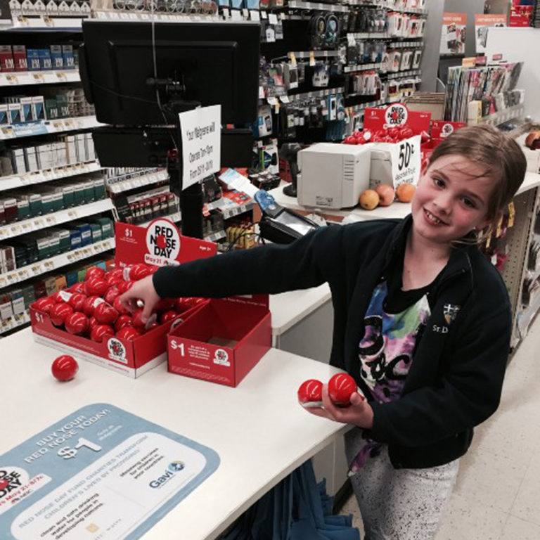
Case in point: A simple tray with a clear price and playful prompt turns a item into an easy “why not?” moment.
2) Angle and height decide whether hands move
Checkout is cramped. Shoppers are half-facing the cashier, half-facing the card terminal, half-watching their kids. Your POSM needs to meet the hand, not wait for attention.
Design rules that work:
- Angle trays forwardso products feel easier to grab and return.
- Keep hero SKUs at chest to waist height(the natural pickup zone).
- Do not stack too deep. If the second row is hidden, it does not exist.
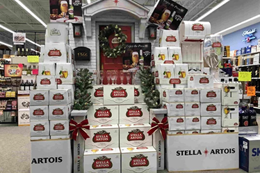
Angled trays and stepped risers also improve “pack face” visibility without needing more space, which is why countertop PDQ (Product Displayed Quickly) formats stay popular.
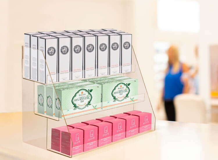
Case in point: A stepped, forward-angled countertop display keeps every pack fully visible and within easy reach.
3) Make the display feel “safe to grab”
A lot of checkout POSM fails because it looks messy, unstable, or intrusive. Shoppers avoid touching anything that feels like it might fall, block the cashier, or slow the queue.
To increase pickup rate:
- Use structured dividers(so each SKU has a “home”)
- Build clean edges(no torn cardboard lips)
- Keep the front row always “full enough” to look maintained
This is one reason branded countertop units and compact fixtures work well: they control the chaos.
4) Use lighting only when it earns its place
Checkout lighting is not about looking premium. It’s about being seen in peripheral vision.
Lighting works when it is:
- A thin LED header glowthat separates your unit from the visual clutter
- A backlit price block(especially for value messaging)
- A soft spotlightthat makes the product face pop, not glare
If lighting creates reflections that hide the price, it backfires.
5) Compact formats that actually perform
Not all checkout POSM formats are equal. The winners are the ones that respect the cashier’s space and the shopper’s movement.
High-performing formats include:
- Countertop PDQ traysfor snacks, minis, travel sizes
- Sidekicks / power wingsnear the queue line for add-ons without cluttering the counter
Slim floor stands right before the payment point (especially for seasonal gifting or bundles)
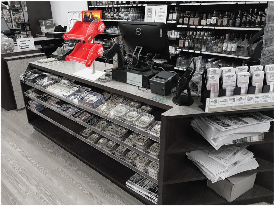
Case in point: Compact checkout formats work best when they stay out of the way but within reach.
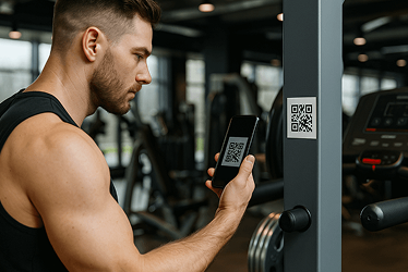
6) QR codes at checkout: only if they reduce friction
Checkout is not where people want to “learn more.” If you add a QR code, it must do one of these instantly:
- Apply a voucher automatically
- Add-to-cart directly
- Join membership with one tap
If it goes to a brand website homepage, it’s dead weight.
Checkout POSM is compressed
Checkout POSM is high-pressure design. You’re working with tight space, low attention, and a shopper already mentally leaving.
But that’s also the advantage.
If your unit is clear, easy to grab from, and written for the final five seconds, it becomes a silent salesperson that does not need staff, noise, or discounts to perform.