Designing POSM for family-oriented brands is about creating a safe, engaging, and emotionally resonant experience that speaks to both kids and parents. Whether you are selling children’s health supplements, baby care, or educational products, your display must earn trust, evoke joy, and make the brand memorable. These are the principles that work across generations.
1. Colour That Captures Both Kids and Parents
Primary colours like red, blue, and yellow excite children, while pastel tones and neutral hues create calm and trust for parents. A smart POSM design blends both worlds by using soft base colours with vibrant accents. This signals both joy and credibility.
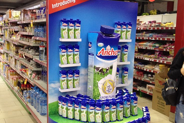
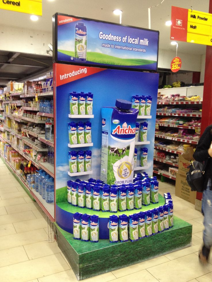
The Anchor milk POSM shown below balances green grass tones and sky blue with bright blue caps and soft cloud backdrops. The display feels clean and cheerful for kids while assuring parents of quality and freshness, enhanced by tiered placement that creates visual clarity.
2.Safety First with Child-Friendly Design
Rounded corners, stable materials, and non-toxic finishes are essential when POSM is placed in family areas. Use secure structures and avoid sharp edges or collapsible elements. Also consider shelf height. Lower displays work well for child interaction, while upper sections can focus on parent information.
The diaper display below features curved shapes, gentle pastel tones, and low shelves. These design choices allow parents to shop quickly while children can explore safely, reinforcing both accessibility and peace of mind.

3.Characters That Appeal to Both Age Groups
Mascots and illustrated figures are powerful when designed to connect emotionally across generations. Friendly animal mascots, expressive icons, or nostalgic themes often work best. The aim is to be fun without being childish.
This Toy Story-themed display features iconic characters like Woody and Buzz Lightyear, recognisable and engaging for kids, while evoking a sense of nostalgia and trust in parents.

4.Messaging That Wins Parents While Inviting Kids
Your POSM headline must be reassuring and benefit-driven for adults. Phrases like “Stronger Immunity for Growing Kids” or “Gentle Care for Happy Tummies” build parental confidence. Surround that message with child-friendly elements like friendly icons or warm illustrations to complete the emotional story.
This POSM for a kids’ probiotic powder features science-backed strain names and health benefits to reassure parents, while its cheerful colours, playful typography, and energetic visuals of children running outdoors evoke joy, trust, and kid-friendliness.

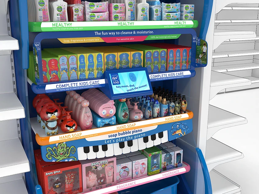
5.Multi-Sensory Features that Create Brand Memory
Children respond to texture, sound, and motion. These can be subtle, such as soft-touch surfaces or gentle lighting, or more interactive, like motion-activated elements. This builds curiosity and positive memory, which parents subconsciously link with brand quality.
In the display shown, the built-in touchscreen invites parents and kids to explore. The hand soap shelf includes a whimsical piano motif, encouraging children to “play” as they wash. Character-shaped bottles and bright visuals reinforce product appeal, while the overall setup turns routine shopping into a sensory-rich moment that’s both fun and educational.
POSM for kids and family brands must win two hearts at once. Children are drawn to colour, play, and sensory delight. Parents are looking for trust, safety, and clear messaging. When a display can deliver both in harmony, it does more than sell. It builds affinity. It creates moments that parents remember, and kids love to revisit. That is the power of thoughtful family POSM.