Retail shelves are designed for efficiency.
Rows are aligned, products are repeated, and categories are organised to maximise density within limited space. Over time, shoppers become used to this structure. The shelf fades into the background because everything begins to look visually predictable.
That is why some of the most effective retail POSM does not rely on size at all. Instead, it works by disrupting the rhythm of the shelf itself.
A small interruption, when placed correctly, can attract more attention than a much larger display elsewhere in the store.
Below are several ways brands use shelf-level POSM to create that effect.
Extending beyond the shelf line
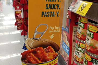
Most shelf communication stays flat against the rack.
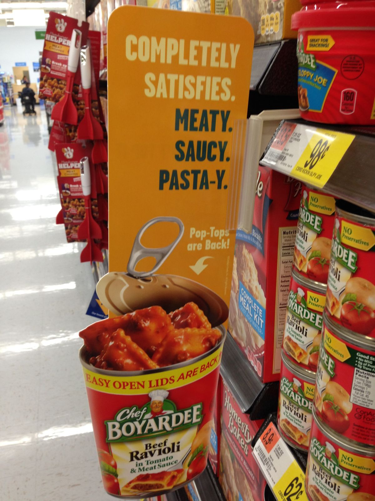
The Chef Boyardee display breaks that expectation by physically extending the product outward into the shopper’s path. The oversized can and raised structure interrupt the straight visual flow of the aisle, making the display noticeable even before shoppers process the copy itself.
The effect is simple but effective. In crowded retail environments where most products compete within the shelf boundary, even a small forward extension can create disproportionate attention.
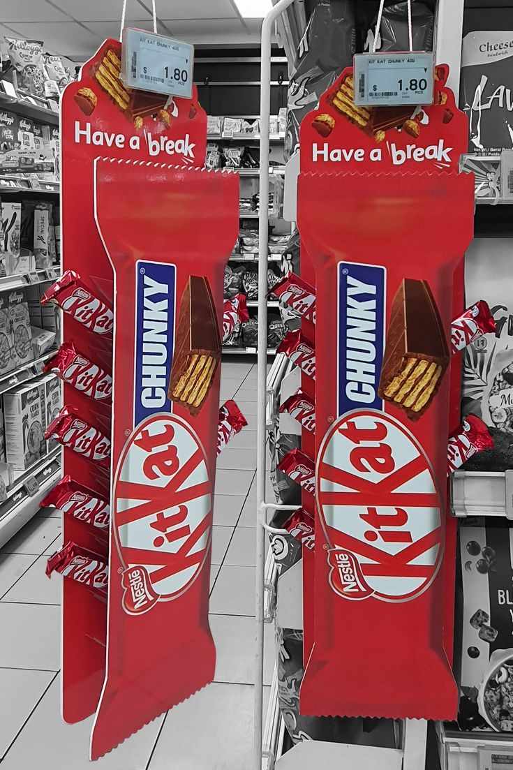
The KitKat hanging display applies a similar principle differently. Instead of projecting outward, it introduces vertical interruption into a largely horizontal retail environment. The elongated format immediately separates itself from surrounding products because it behaves differently from the shelf around it.
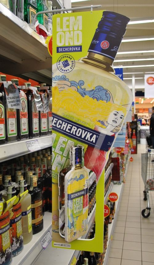
The lemon vodka shelf extension applies the same principle differently. Instead of using a simple signboard, the structure stretches vertically across multiple shelf levels, creating a stronger interruption within the aisle while still occupying relatively little physical space.
In these cases, the display works because it breaks the shelf boundary rather than staying confined within it.
Using verticality to interrupt repetition
Retail shelves are heavily horizontal by nature. That is why vertical formats often stand out quickly.
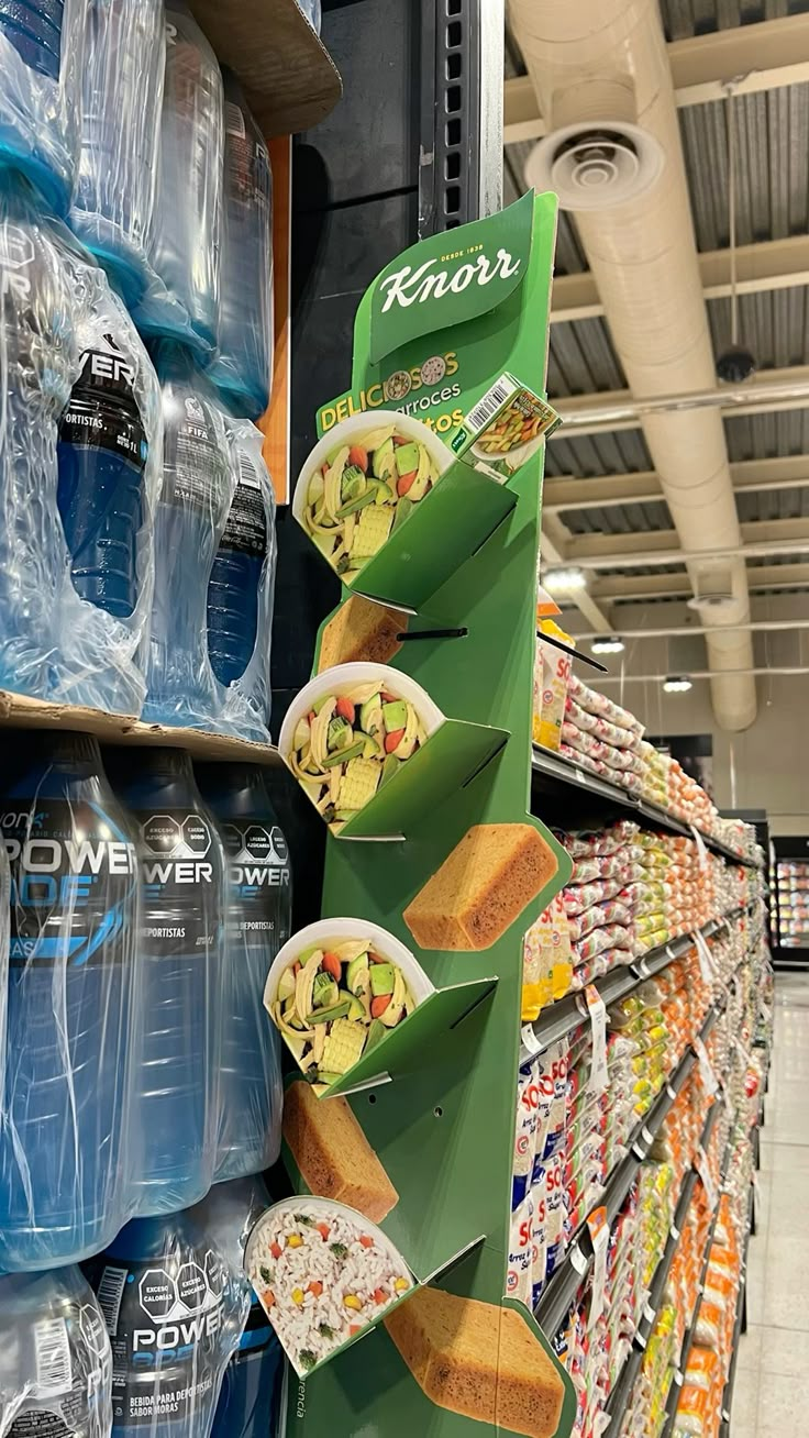
The Knorr vertical rack creates visibility by stacking products upward in a narrow footprint along the aisle edge. Instead of competing directly within crowded shelving, the display forms its own visual column beside the products.

The Tang hanging display works similarly. Suspended from the shelf rather than sitting inside it, the structure introduces a different viewing angle into the aisle. The circular arrangement also contrasts against the rigid rectangular geometry surrounding it.
Neither execution dominates the environment aggressively. They simply introduce a different visual rhythm into a highly repetitive retail structure.
Turning product storage into communication
Some shelf displays become effective because the storage mechanism itself becomes the visual idea.
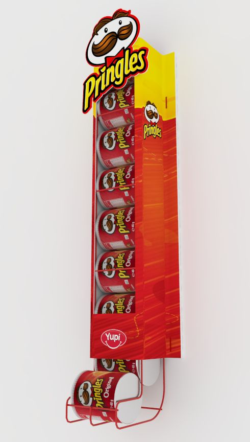
The Pringles hanging strip is a strong example. The product packs are suspended vertically in sequence, allowing the cylindrical shape of the packaging to become part of the display structure naturally.
The execution feels lightweight and space-efficient, but it remains highly visible because it behaves differently from the surrounding shelf arrangement.
This is particularly important in smaller retail environments where floor space is limited and every shelf interruption must justify its footprint.
Why these displays work
These executions succeed because they understand how shoppers actually experience retail aisles.
Most purchasing decisions happen while people scan shelves quickly, often without full concentration. In these environments, attention is rarely captured through complexity. It is captured through interruption.
A curved edge.
A vertical structure.
A hanging format.
A display extending slightly into the walkway.
Small changes in structure can create disproportionately large changes in visibility.
And in modern retail, where almost every shelf is crowded with competing messages, that difference matters more than ever.