Most shoppers think they choose with their eyes. In reality, they choose with their bodies first.
Before a word is read or a price is processed, the shape of a POSM already signals how a shopper should feel, move, and interact. Rounded edges invite approach. Sharp lines command attention. Height suggests importance. Angle suggests effort or ease.
This is the quiet psychology of form and it plays out every day in aisles, endcaps, and gondolas.
Shape Speaks Before Copy Does
The human brain processes shape faster than text. That means POSM structure sets expectations before messaging ever lands.
Rounded and circular forms tend to feel friendly, safe, and inclusive. They reduce perceived risk, which is why they work well for wellness, family, or everyday-use products.
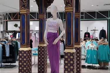
Angular, geometric structures feel deliberate and premium. Straight lines and sharp edges signal control, precision, and authority, making them effective for luxury, gifting, or hero SKUs.
The takeaway is simple. Form already frames the story. Copy only confirms it.
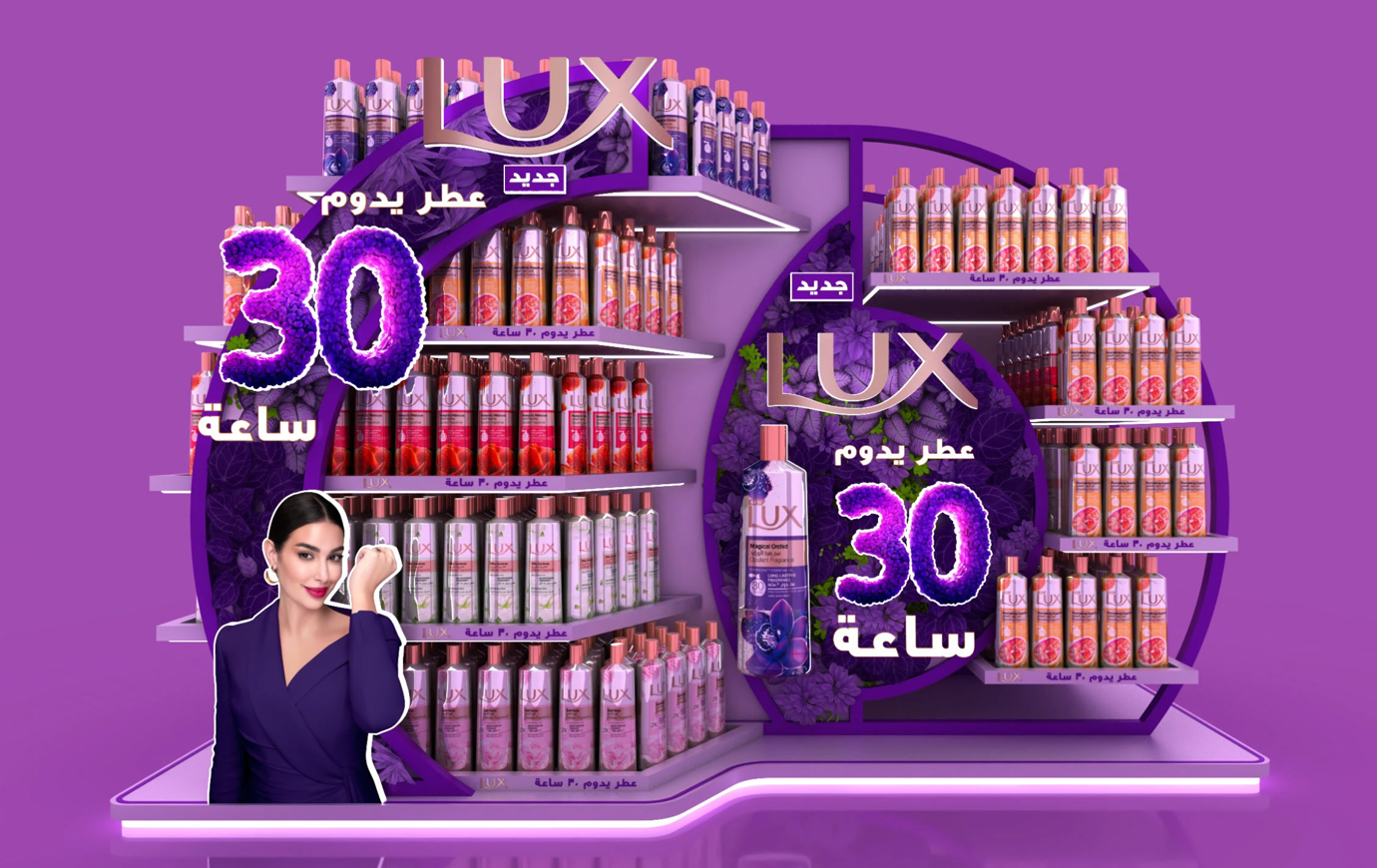
Case in point: A sculptural POSM that uses bold circular framing and clean geometric shelving to signal confidence and premium intent at first glance.
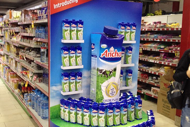
Height Signals Importance and Urgency
Taller POSM structures naturally draw the eye upward, interrupting the shopper’s horizontal scan of shelves. Height creates hierarchy. What sits higher feels more important, more considered, and more worthy of attention.
This is why hero products often perform better when elevated, even without extra claims. Conversely, low-profile POSM works better for bulk, refill, or stock-up categories where convenience outweighs aspiration.
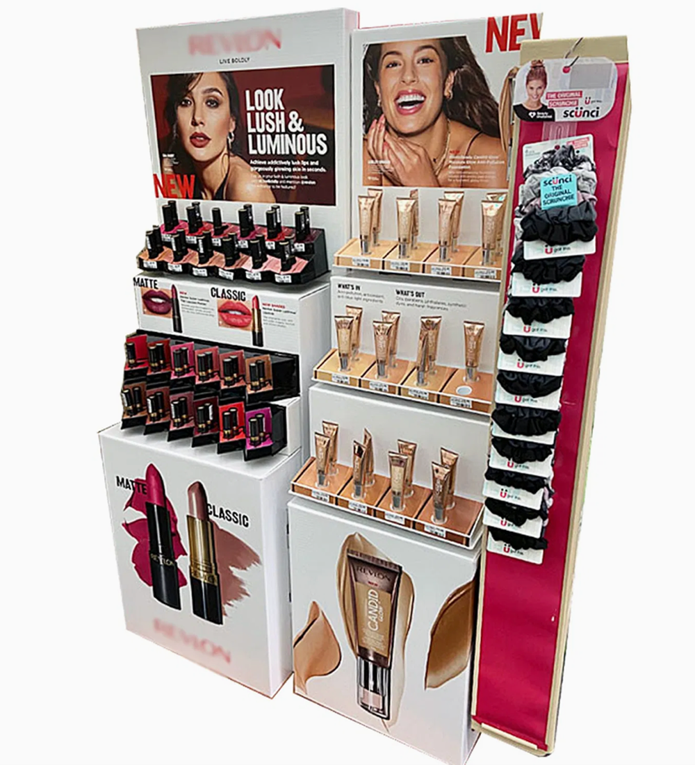
Case in point: A tall, tiered display that lifts hero products above the shelf line. The extra height breaks the shopper’s usual left-to-right scan, making key items feel more important and easier to notice.
Angles That Invite the Hand
Flat, upright shelves present information. Angled shelves invite action.
A slight forward tilt subtly reduces effort. Products feel easier to pick up, examine, and return. This matters especially in high-traffic environments where shoppers make fast, low-commitment decisions.
Angled trays also improve visibility without increasing footprint. More pack faces are seen, and fewer are hidden behind one another.
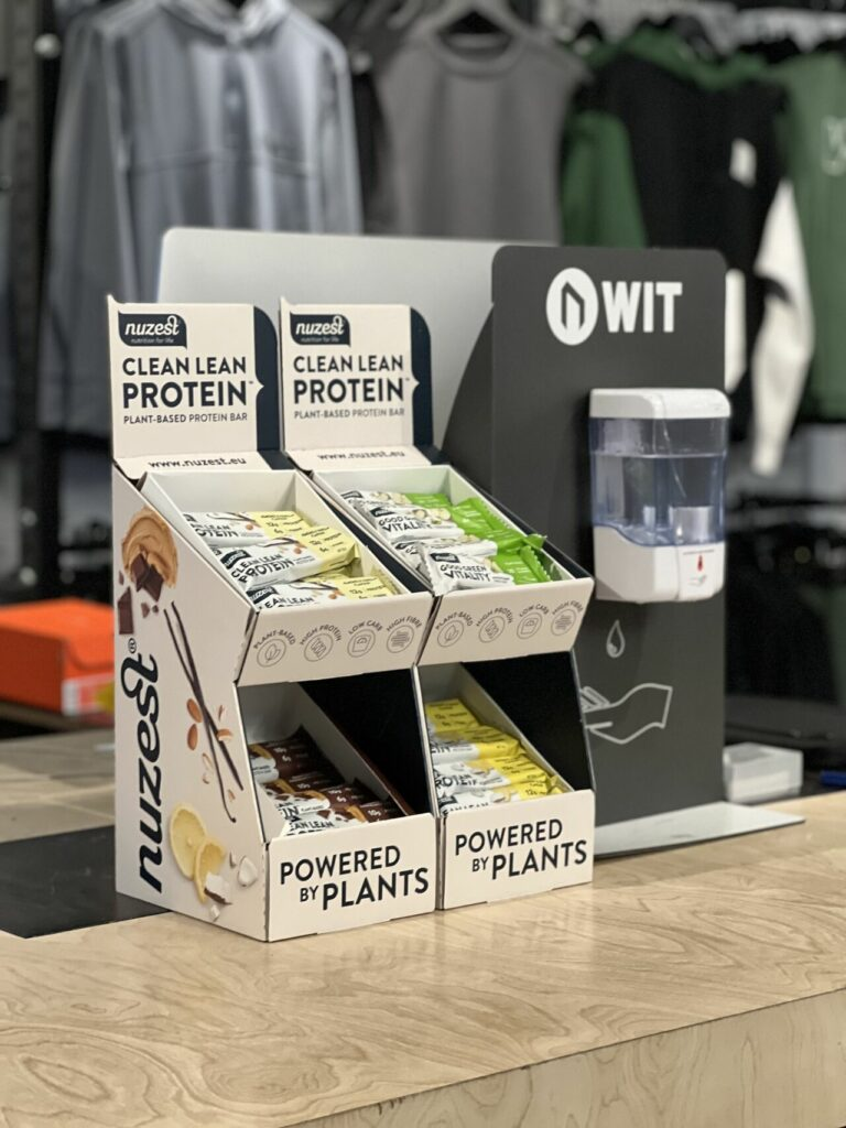
Case in point: The slight forward tilt makes items feel easier to pick up and put back, encouraging quick interaction while keeping every pack clearly visible in a compact footprint.
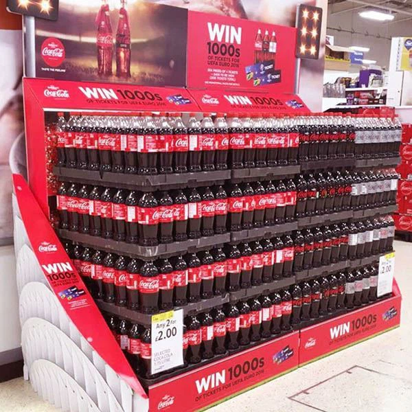
Zig-Zag Layouts Increase Dwell Time
Linear displays encourage speed. Patterned displays encourage pause.
Zig-zag or stepped layouts slow the eye down, guiding it across multiple SKUs rather than straight past them. The shopper spends more time scanning, comparing, and considering.
This is particularly effective for ranges with variants such as flavours, strengths, or routines. The structure itself encourages exploration without needing extra explanation.
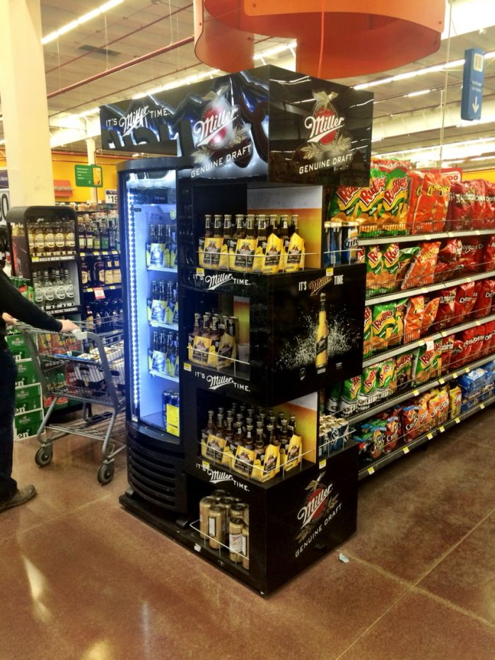
Case in point: A zig-zag layout breaks the straight-line shelf scan. By staggering products across levels and sides, the display naturally slows shoppers down, nudging them to browse variants instead of walking straight past.
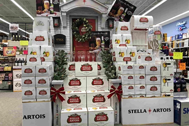
Triangles Create Stability and Focus
A wider base with a narrower top feels stable and intentional. The eye naturally travels upward to the apex, where brands often place a hero product or key message.
This structure subconsciously reassures shoppers that the display is organised, complete, and worth trusting. It also keeps the POSM from feeling cluttered, even when multiple units are involved.
Stability is a psychological cue. When a display looks stable, the purchase feels safer.
Case in point: A wide base with a gradual build-up keeps the display looking solid. The eye naturally moves upward, making the top tier feel like the focal point while the overall stack still feels easy to trust and shop from.
Structure Shapes Behaviour, Not Just Space
POSM structure tells shoppers where to look, how long to stay, and whether to reach out. The right one can quietly lift pickup rates without changing a single word of copy.
The brands that win at shelf are often not louder or more colourful. They are simply better shaped for human behaviour.