When shopping, customers often make snap decisions in-store, many within just five seconds. In that brief window, a well-designed shelftalker can make the difference between your product and a competitor’s ending up in the basket. With the right design and message, this small but powerful piece of retail signage can stop shoppers in their tracks, spark curiosity, and drive impulse buying right at the point of decision.
Shelftalkers are more than colourful shelf décor. They are precision tools that influence shopper behaviour exactly where it matters most: at the decision point.
What Is a Shelftalker?
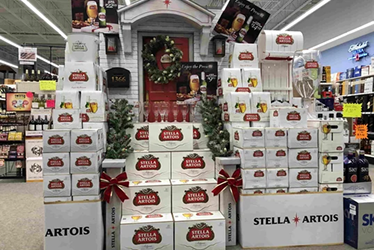
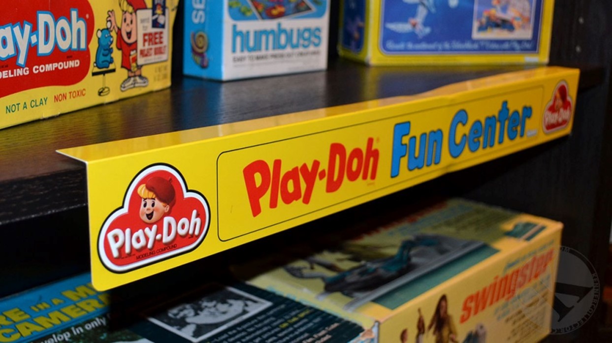
A shelftalker is a piece of retail signage placed on the edge of a store shelf. Its purpose is to attract attention, highlight a product, and deliver persuasive information in a matter of seconds. They are often called silent salespeople because they work quietly but effectively, right where purchase decisions are made.
The Psychology Behind Shelftalkers
Research shows that up to 70% of purchasing decisions are made in-store, with many being unplanned. Shelftalkers interrupt a shopper’s autopilot by using visual elements such as bold colours, strong contrast, and motion. These are often paired with short and urgent copy like “Limited Time Offer” or “Best Seller”.
Shelftalkers also tap into powerful psychological triggers, including:
- Social proof: “#1 Voted by Malaysians!”
- Scarcity: “Only While Stocks Last!”
- Curiosity: “New Formula, Try It Today!”
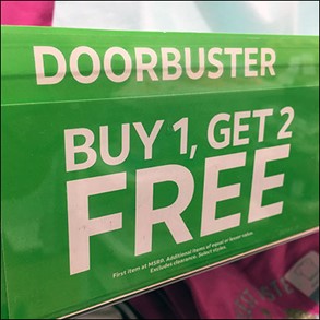
- Savings: “Buy 1 Free 1”
These emotional nudges create a sense of immediacy and value, making the decision to buy feel easier, more logical, or even smarter.
How to Maximise Shelftalker Effectiveness
- Eye-level placement is crucial
Because shelftalkers are compact, placement is key. Aim to position them at adult eye level, around 1.5 metres from the floor. If your product targets children, adjust the height accordingly.
- Keep it short and punchy
Most shoppers do not read in detail but scan quickly. Keep your message to between three and seven words. Choose direct, benefit-led phrases like “50% Off Today Only” or “Fast Relief in One Dose”.
3. Use high-contrast colours
Colours influence both visibility and emotion. Red creates urgency, yellow attracts attention, and blue evokes calm and trust. Combine bold backgrounds with legible fonts to ensure the message is seen from a distance.
4.Match tone to product category
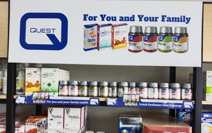
Your message should reflect the nature of your product. Health products may need clean, professional typography and claims like “Clinically Proven”, whereas snacks or beverages might benefit from vibrant designs and fun copy such as “Sip Joyfully” or “Crunch Into Fun”.
5.Localise the message
In a diverse market like Malaysia, using language and visuals that resonate culturally can increase effectiveness. Consider incorporating Bahasa Malaysia, English, or Mandarin depending on the outlet, and use familiar phrases or imagery that connect with local shoppers.
Learning from the Best
Watsons Malaysia provides excellent examples of effective shelftalkers. Their displays often feature bold designs, strong call-to-actions, and time-sensitive messages like “PWP Up to 50% Off” or “Spend and Win to Japan”. Positioned directly next to the product, these shelftalkers give shoppers the confidence and motivation to act, especially for unplanned purchases.

Quick Checklist for Shelftalker Success
- Limit to three to seven words
- Use fonts with good readability
- Ensure strong contrast between text and background
- Position at eye level for visibility
- Include a clear and simple call to action
Small Footprint, Big Results
In the retail world, influencing shopper decisions is the ultimate goal. Shelftalkers offer a low-cost yet high-impact way to achieve this. They not only increase product visibility but also guide purchasing behaviour, stir emotions, and prompt quick action.
If you are an FMCG brand aiming to convert shelf space into sales, investing in well-crafted shelftalkers could be one of your smartest marketing moves.