Point-of-sale materials (POSM) are displayed at almost every store.
From the grocery store to the gas station, we’re constantly exposed to an onslaught of signage and ads. And while some of these messages may be compelling, many are not.
It’s easy for marketers to make mistakes when designing their POSM – especially if they don’t know what mistakes to look out for in the first place!
If you’re launching a new product or putting your brand out there, you only have one chance to make a good first impression. Getting off on the wrong foot with customers can really hurt your brand.
Here are five mistakes you should avoid with POSM displays:
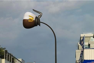
1. Using POSM displays as a substitute for product packaging
It’s a common mistake for retailers to invest in captivating POSM displays while paying less attention to product packaging. This is not only ineffective but also costly and confusing for customers.
When it’s time to make a purchase, most people are looking for an easy way to get in and out of the store. This is where POSM displays come into play. When they see something they want, it’s easier for them to just grab it, check it briefly, and go.
But with these displays becoming more common than ever, brands need to be careful not to rely on them too much. While you might think that your customers will know better when something isn’t right – they don’t always do their due diligence before making a purchase. How many people thoroughly study the label to find out about what they’re buying?
As a result of this, they may not buy what is right for them. It should be the other way around – POSM displays should amplify product packaging instead. It’s a bigger, eye-catching version of the brand’s personality that’s reflected in the packaging.
Designing POSM displays in this manner wins shoppers over for the right way, by underlining what makes a brand special rather than through temporal gimmicks that don’t align with what the brand offers.
2. Using too many words on your displays that confuse customers
Good copywriting lands the knockout blow as quickly as possible. However, bad copywriting happens all too often on POSM displays.
A common example is having all of the features listed in one area such as “our product does this, this, and this.” This makes it difficult for customers who may want specific features which might be located elsewhere on the display or hidden amongst other information about the brand’s products, services or brands.
Instead brands should place emphasis on highlighting benefits instead of just listing features. You might be wondering how you can make your benefits resonate with customers. It sounds easy to list all the features of a product, but it’s not that simple – and may even backfire on you!
To really get people excited about what they’re buying, focus instead on their needs and then show them why your products fulfill those requirements best while also explaining why this is true. Do it in as few words as possible, like this counter top display:
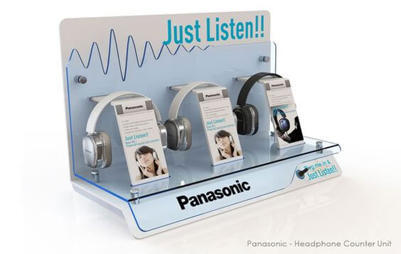
Sometimes you don’t need to explain, just get shoppers to try the product (Source: Pinterest)
The design should be sufficiently interesting and creative to capture the customer’s interest for as long as possible while not being overwhelming or underwhelming. The trick is to find that sweet spot; is your POSM engaging enough to hold their gaze and get your message, while not beating them over the head with cluttered, over-the-top visuals?
3. Not making your displays interactive
It’s a well-known fact that people can’t resist playing with things, and they’ll do it for as long as you let them. The point of purchase is no exception to this rule – in fact, it’s the perfect place to put interactive displays that will keep your customers engaged and coming back for more.
However, many companies still don’t take the time or expense to make their displays interactive.
The problem with this lack of interactivity is that it makes customers less likely to want to interact with your company in general, especially when stores are getting crowded with competitors each working hard to win shoppers’ attention.
Interactive POSM displays don’t necessarily have to be high-tech or larger than life. It could be as simple as being Instagram-worthy, where shoppers can’t help but to pull out their phones to snap a photo or hit record.
Take for instance this 3D bull animation used by Pavilion Mall in Bukit Bintang, Kuala Lumpur:
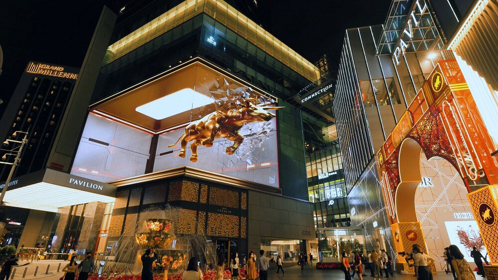
Source: Malay Mail
4. Forgetting to check if your text and logo are legible from 3 feet away
Some products would require brands to explain how they work, especially if it’s a new innovative product that’s not quite what shoppers are used to yet. The main problem with doing this in your POSM display is legibility. Shoppers have to get really close to your display before they can even read what it says.
This is a huge problem for brands. If customers can’t read the text on their products, how will they know about the product? How will they decide if this is right for them? Most importantly, would they even care to give their attention to the product POSM in the first place?
The solution might be so obvious that it’s easy to miss – use legible fonts and clear wording in your point of purchase designs! One good rule of thumb to follow is to test whether you can recognize the copy and visual elements clearly 3 feet away from your POSM display.
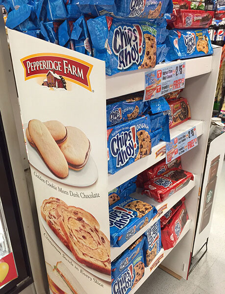
Another pointer is to use visual hierarchy in your copywriting.

POP displays don’t afford too much space for copy (Source: Repsly)
The hook, or the most attention-grabbing copy that would help pique shoppers’ curiosity, should be the largest and most prominent text. When they’re interested, they’ll come closer and read. Once they’re close enough, they’ll be able to make out other useful details.
5. Not being mindful of your customers’ time and attention span
Many different marketing messages bombard shoppers at any given time. One of the biggest mistakes to make is not putting yourself in their shoes. Brands need to design POSM displays that go beyond conveying benefits but also consider the mental capacity of shoppers.
One important factor to consider is location. If your display is in a convenience store, it’s likely that customers won’t spend too long deliberating but would just quickly grab what they want and pay. If it is in a supermarket, then they may spend more time pondering their purchases and may devote more attention to considering different options to purchase.
POSM displays that are inappropriate make it hard for shoppers to find the information they need to be persuaded to make a purchase, or cause information overload and ultimately still deter them from deciding to buy.
At least make sure the standee matches the products (Source: Schnapp Crackle Pop)
To avoid this mistake, keep testing and refining your designs. Ensure your displays are easy to read and understand, with all of the info that shoppers need in one place. With POSM displays that are optimized with the right balance of visual appeal and persuasive info, shoppers can quickly find what they’re looking for without wasting any of their valuable time. Otherwise they’d just opt for a competitor brand instead.
Conclusion
It’s easy for businesses to focus too much on digital marketing and forget that retail experiences can still affect their sales performance. For those of you who have been in retail for a while, you know that POSM displays are one of the most important parts of marketing.
They can make or break your product launch and customers’ perception brand. More immediately, they’re often what determines if a customer purchases from your shelf.