The use of point-of-sale materials (POSM) displays has seen brands employ all sorts of designs to make sure that shoppers pay attention to their products. Some are more creative than others.
Some, on the other hand, stand out not by having more attention-grabbing elements, but by being more effective at drilling down to a core message and doing away with unnecessary elements in favour of communicating with shoppers through clarity, confidence, and no frills. That in turn, makes them more attention-grabbing.
While true in many cases, being minimal does not mean being aesthetically sparse or needlessly plain, but favouring highly effective simplicity in connecting with shoppers. Doing so is, after all, the ultimate goal of POSM displays.
Here are three inspirations for creating minimalist POSM displays that hit the nail on the head for three important areas in retail.
1. Sustainability – Standbox Shoe Display
Imagine walking into a shoe store, seeing a shoe you fancy, trying it on, paying for it, and taking the shoes home with the display stand – no plastic or paper bag needed. The conceptual take of Standbox allows for a minimal, stylish, and sustainable way to display shoes in retail.
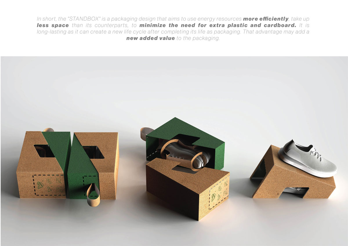
Source: Dieline
While not so much a POSM display in strictly a traditional sense, the Standbox is a retail display marvel that can count as point-of-sale given that it:
(i) acts as a means of display a product and doing away with the need for standees and wall displays;
(ii) communicates the environmental stance and ergonomics focus of brands that decide to employ its recyclable eco-design.
If spotted in a retail setting, this display-packaging is a statement that speaks for itself, no words needed.
2. Interactivity – Apple Store
The mistake many minimalistic retail stores make is appearing so clean, curated, and manicured that they seem more like museums instead of outlets for people to browse, experience, and make purchases.
Not Apple though.
It would be remiss to talk about minimalism in retail without mentioning the tech giant. Despite having mostly immaculate POSM displays, its stores continue to showcase a keen focus on shopper-product interactions.
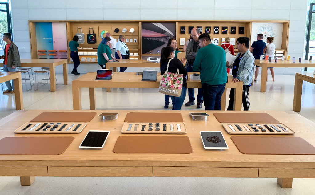
Source: 9to5Mac
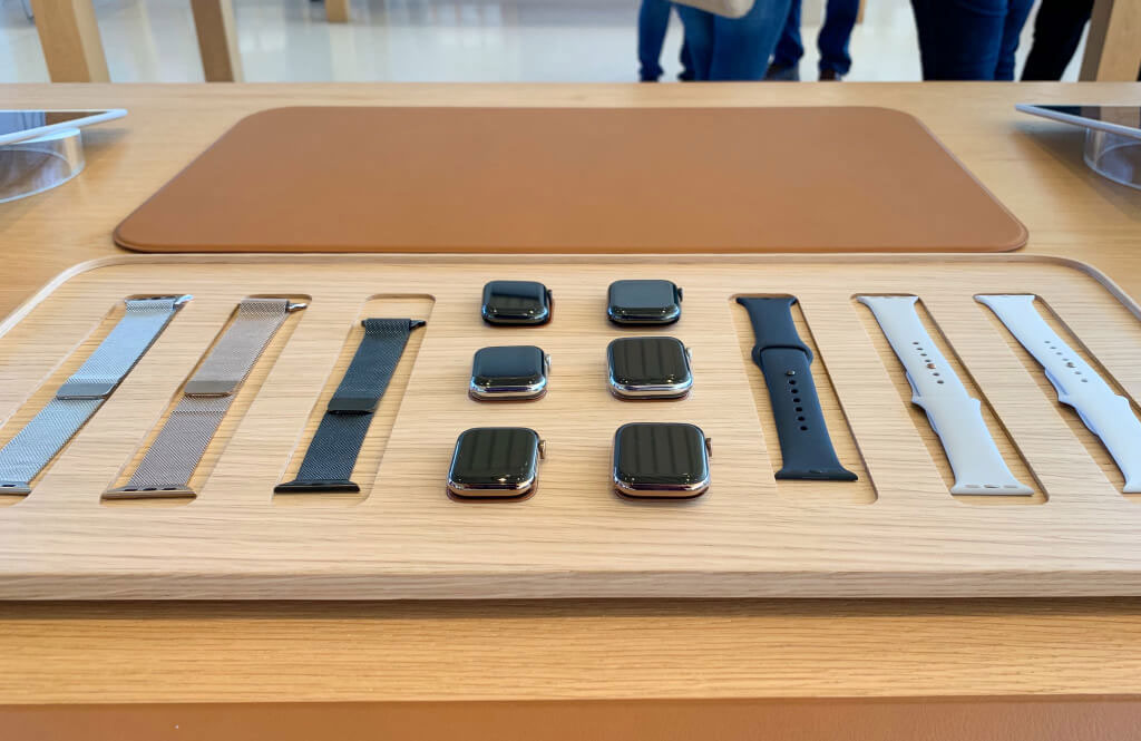
One great and not-so-common example is the layout update of its store at Apple Park, Cupertino. Desk mats are set up so that shoppers can have the space to try on Apple Watches with different straps.
Shoppers are given options, of course. If they wanted to, there’s a table for them to just check out the display items already with straps on.
Self-explanatory and minimalist. No fancy signage or impressive setups, just carefully laid out products, colour-matched desk mats, and ample room for multiple shoppers to experience the customizability of the Apple Watch.
For brands that could do this well, it’s a good way to push up sales, or at least encourage shoppers to give more consideration to the products.
Source: 9to5Mac
3. Versatility – Ferrero Rocher
If there is one brand that could continually stand out in mundane supermarket settings without looking out of place, it’s Ferrero Rocher. It distinguishes itself as premium, but is not alienated from shoppers.
That comes down to the Ferrero Rocher design DNA, which is apparent from its POSM displays.

Source: Behance
Clad almost entirely in gold except for trimmings, the Italian chocolate brand is able to convey a sense of opulence through a variety of configurations (typically stacked like a tree, pyramid, flower bouquet or heart shape).
Copy is absent from its displays, so all shoppers would only be able to see its name. That’s enough – they know what Ferrero Rocher is.
That minimalist approach is what gives the brand its versatility. It retains its core brand identity and makes it malleable across contexts (perhaps not a wet market or thrift store). While it may not look the best in certain settings, it fits into most retail environments.


Making the message count with the minimalist approach
The countless ways that retailers use to make sure shoppers pay attention is a point of interest. POSMs come in all shapes and sizes.
Many, however, are loud, distracting and largely ineffective at prompting the intended response from shoppers (e.g. getting the shopper to pause and consider the product, encouraging impulse purchase, general brand awareness etc.).
That’s why taking a minimal and highly intentional approach to creating an effective POSM design is a worthwhile approach. As shown by the examples in this article, the end result may look easy, but achieving it is actually quite difficult. When brands actually do achieve it, it’s worth paying attention to.
Have you seen any minimalist POSM designs in retail that are worth remembering?