Whether it is promoting a large financial guru program or helping your auntie down the street sell her freshly baked Chinese New Year cookies, buntings are here to stay. Compared to the traditional billboard or radio advertisement that cost thousands of ringgit, buntings are relatively inexpensive and reusable for the most part.
However, given how ubiquitous they are in the market today, especially when nearly everything a shopper or pedestrian sees is some form of advertisement, it can be extremely hard to catch enough eyes with a boring and uninspiring bunting.
Here are some pointers you’ll probably want to think about when discussing your upcoming bunting with your designers.
Strong but Short Catchphrases
We get it, sometimes you’re anxious or excited about your product and you want everyone to know every little detail about it. But most times it would be better to work on a short but interesting catchphrase instead, something that summarizes your product in as little words as possible.
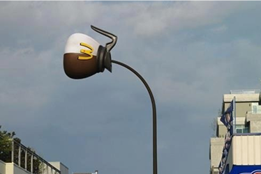
Given how people are often emotional buyers, a good place to start would be words that describe a feeling of what audiences are looking for. Though they rarely put out buntings, Apple does this brilliantly for their iPhones, and that is a practice you can port over to your buntings.

Source: Apple
With fewer but stronger words, your bunting has the double benefit of attracting more viewers with their larger and bolder text plus the intrigue of finding out what your product is all about.
Pick Your Colours Wisely
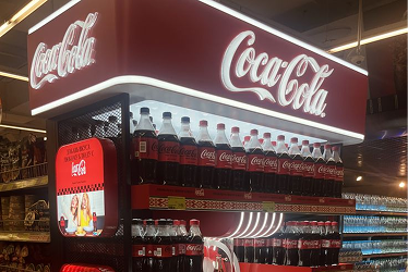
Colour is often used to trigger certain moods and feelings which is why choosing the right colour theme can make or break your bunting. So before coming up with your design, it is good to take a step back and think about the theme that best suits your product.
For instance, a black and gold is often paired together to symbolize luxury and exclusivity which is great for a high-end sports cars for the elite few but not so much for a potato chips brand made for everyone. Besides that, culture also needs to be taken into account as something as simple as the colour red may mean different things between Asians and Westerners.
One good rule of thumb is going with a minimalist two-tone approach which is very eye-catching given high contrast which can also be used to highlight information key information easier.
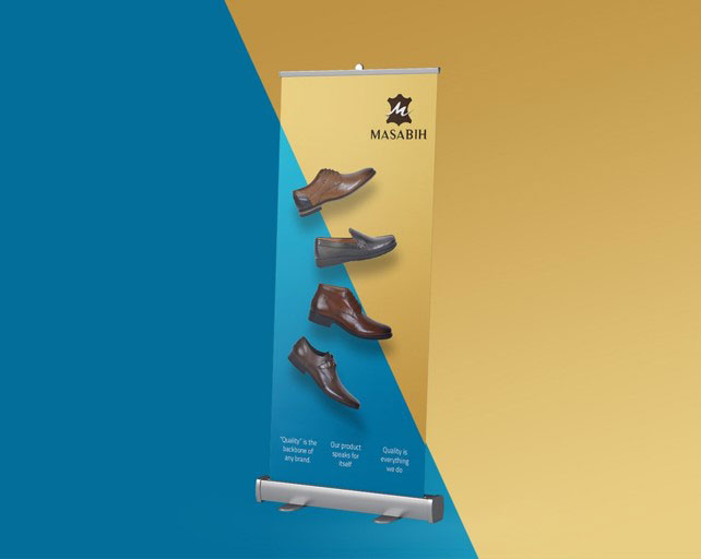
Source: Behance
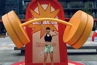
Convey Info through Visuals
Let’s face it; people nowadays don’t like to read, especially when they’re out and about. So when it comes to educating the masses about your latest launch, it would be much better to adopt strong visual storytelling instead.
A no brainer would be restaurants blasting up a huge picture of their best-selling lamb rack dish to tempt hungry passers-by whereas for corporate organisations promoting something more intangible and technical in nature, a liberal use of symbols would be preferable to paragraphs of tiny words on a bunting instead.
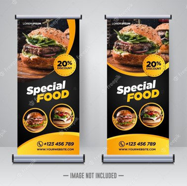
Source: Freepik
Extend Beyond Borders
Yeah, we’ve all seen a rectangular bunting more than once before. However, rules are made to be broken and sometimes expanding out beyond the square box can net you a few curious onlookers. Take for instance the Coca Cola Cricket bunting below.
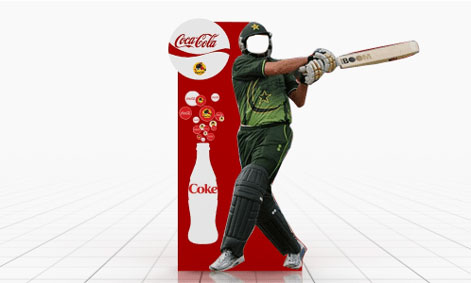
Source: Behance
While it may seem quite simple but in a country like India or Pakistan where the sport is almost like a religion or way of life, the ingenious cut-out at the face section of the cricket player serves as an open invitation for customers to come over and take pictures which increases your brand presence and awareness further down the line when it inevitably gets uploaded on social media for the likes.
So those were some of the few bunting design rule of thumbs we think are worth paying attention to. How about you? Have you seen any recent bunting or POSM designs that you think deserve an honorable mention?